Back to works

Rethinking how users find and explore research content

Content Catalyst is a white-label publishing platform used by research firms to deliver reports and datasets to their audiences.

Client
Content Catalyst
Industry
B2B SaaS
Service
UX Research & Conceptual Design
Team Setup
1 researcher + 1 designer
Timeline
5 weeks

Goal

Content Catalyst is a long-standing platform that supports complex publishing workflows and flexible client customization. As the product continues to evolve, their team wanted to take a step back and consult UX experts about possible improvements.

We partnered with them for a short, focused engagement to map the current experience, identify  strengths and friction points, and propose a unifying design direction.

Challenge

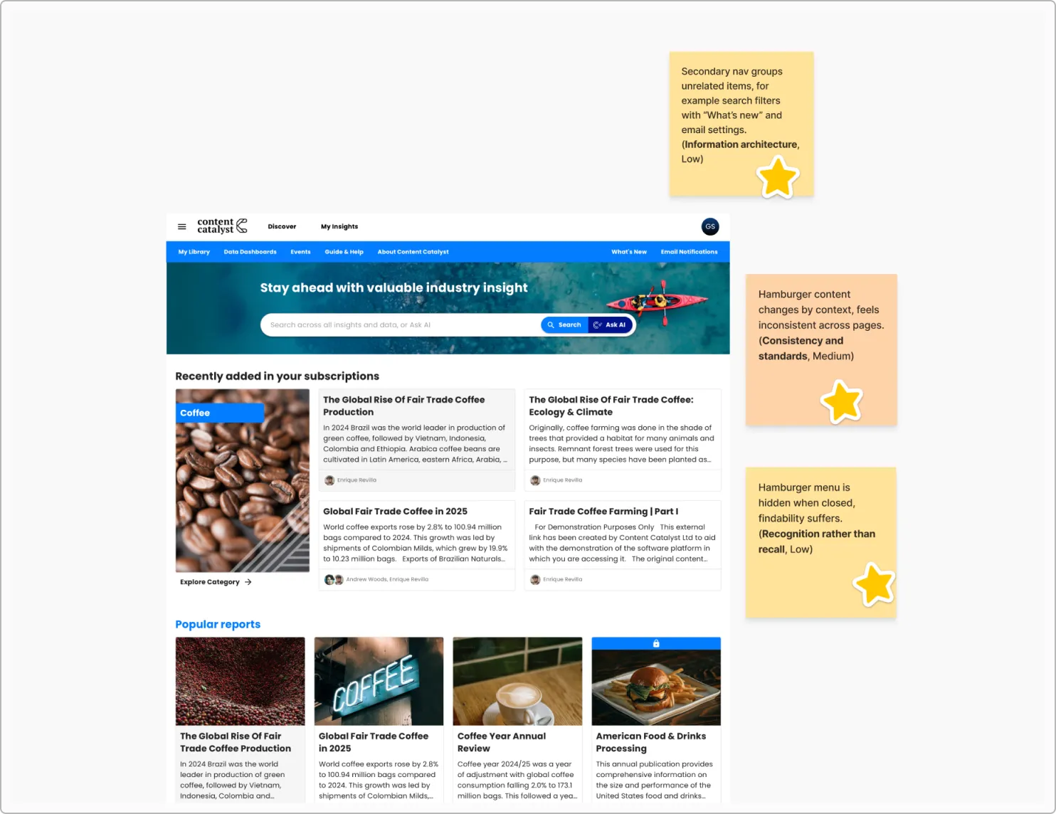
As a white-label platform, flexibility is Content Catalyst’s major strength, but it also means that different ways of navigating, browsing, and searching content have evolved side by side.

As a result, users could complete tasks, but often lacked a clear sense of:
•  where they were in the platform,
•  how different actions related to each other,
•  and what would happen after taking an action.

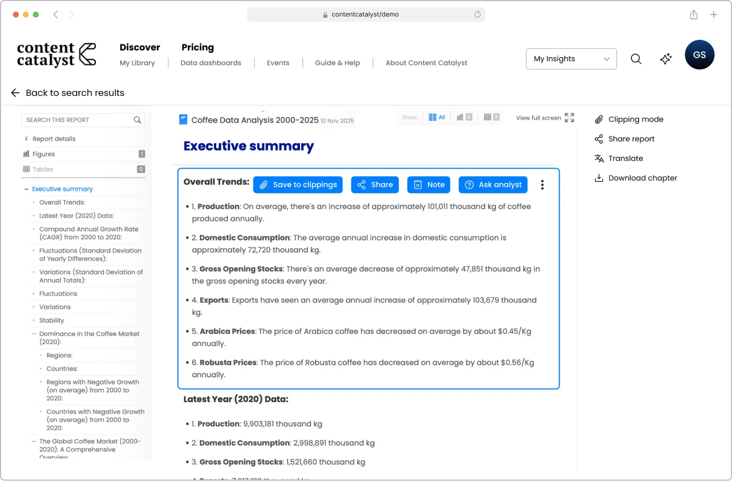
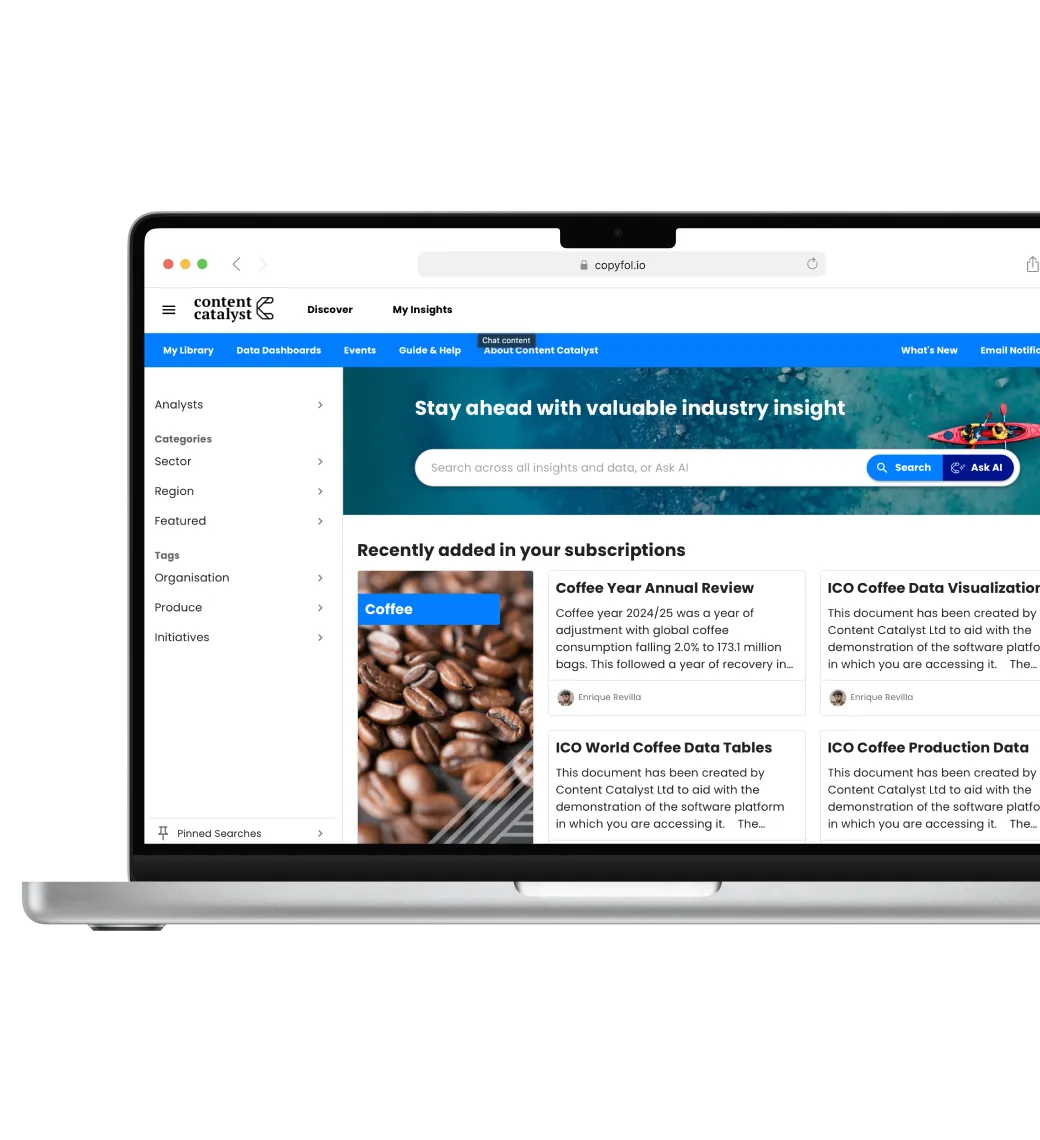
We needed to clarify the core discovery experience through  UX design and research, with a focus on quick wins.

Outcome

The collaboration resulted in:
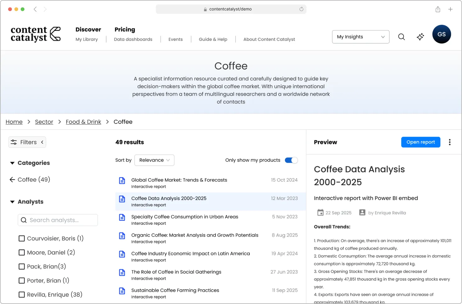
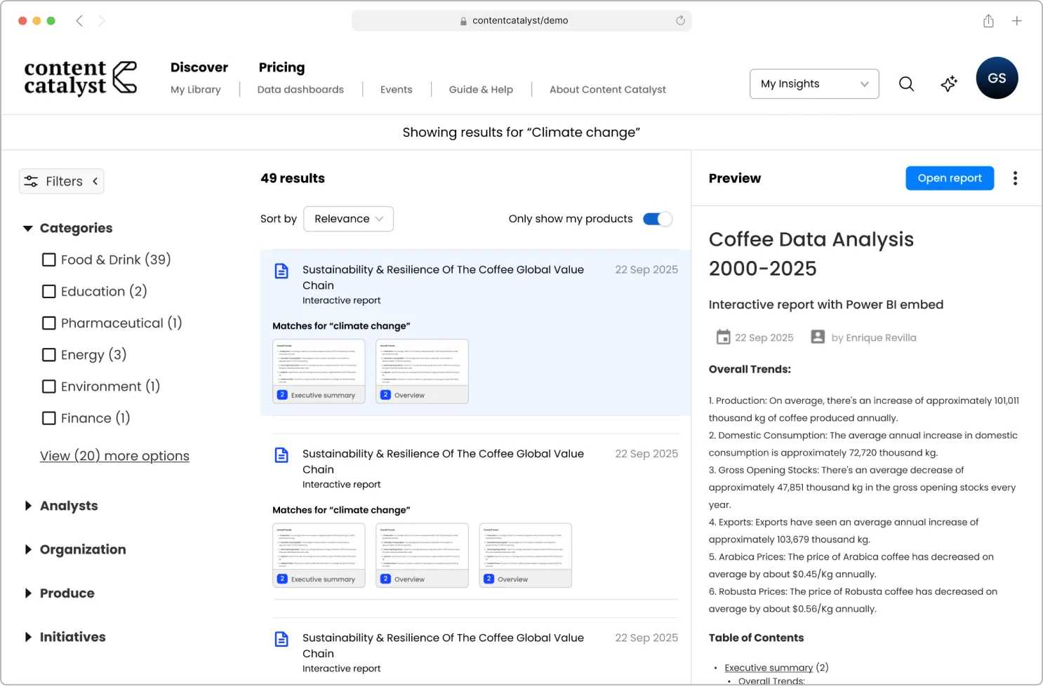
•  an interactive, unbranded wireframe prototype,
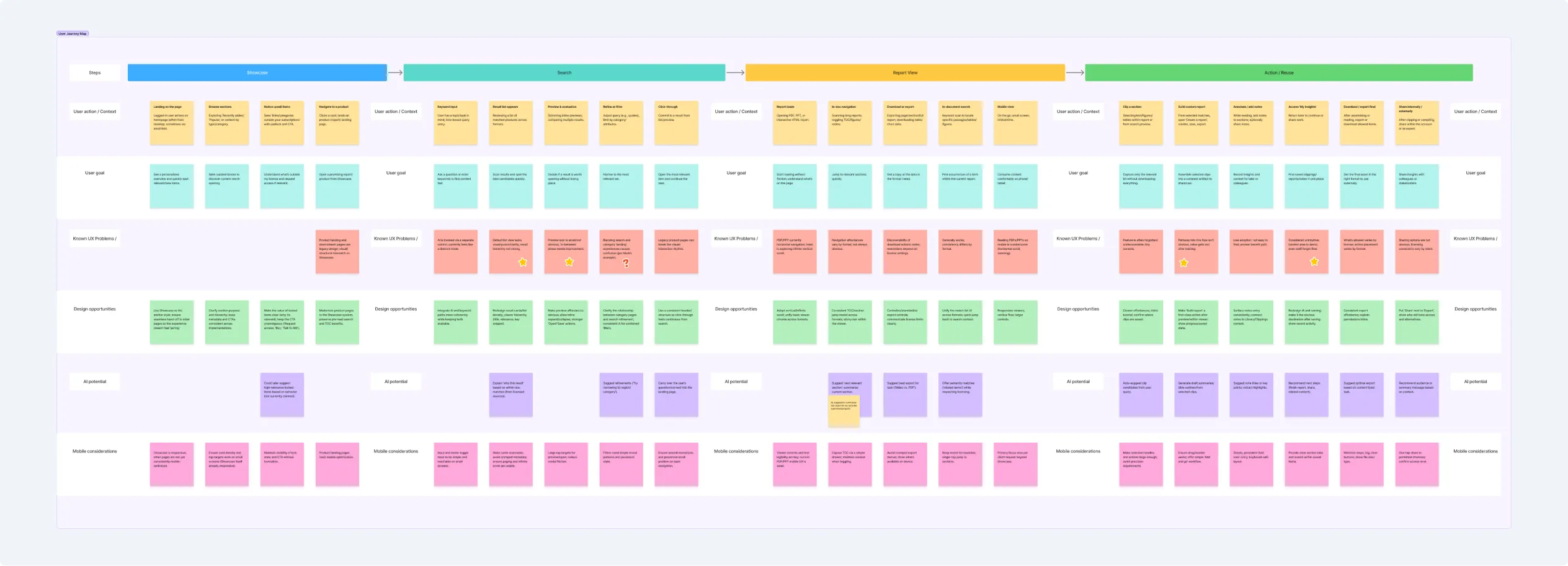
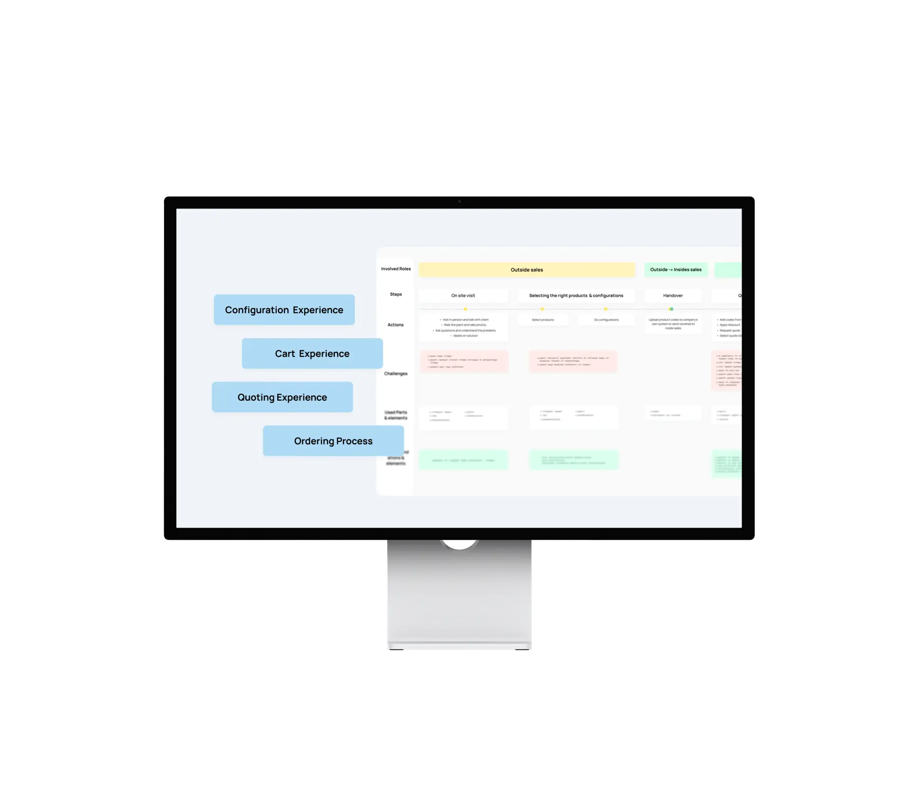
•  a refined & reusable user journey map,
•  research findings and recommendations

This outcome responds to major pain points and provides a clear foundation for evolving the discovery experience even further.

36%
conversion rate
65%
adoption rate
91%
positive feedback
Project timeline
1 /
Our approach

Alignment & discovery
We started with a kickoff workshop to establish a shared understanding of core user groups, their real world tasks and pressures, and the most important problems to focus on.

To complement this, we conducted a stakeholder interview with Content Catalyst’s Head of Design, who provided additional context and a new perspective.

Experience mapping
We expanded the client’s existing user journey map with a focus on the  discovery flow, highlighting moments of uncertainty and future design opportunities, including potential AI touchpoints.

Heuristic evaluation
We conducted a heuristic review of the existing interface to surface smaller interaction and UI-level issues that had a strong cumulative effect on user confidence.

Combining strategic insights with detailed interface observations allowed us to balance big-picture clarity with actionable improvements.

Heuristic evaluation in practice

Usability testing
We validated the concept through short, task-based usability sessions focusing on orientation, confidence, and flow.

User journey mapping results
2 /
Key insights

Across research, testing, and journey mapping, one recurring theme emerged.Browsing and searching were technically functional, but conceptually blurred.

This led to users often hesitating and backtracking,  missing opportunities for deeper exploration.

This insight became our central design question: how might the platform feel predictable  as users move between exploration and precise search?

3 /
Design direction

Rather than treating the design challenge as a navigation problem alone, we focused on clarifying intent.

The final concept introduced two clearly defined modes:

Browse mode
 Built around the existing category hierarchy
•  One active category at a time
•  Breadcrumbs for orientation
•  Category landing pages with clear structure and featured content

Browse mode with categories and a breadcrumb

Search mode
•  Centered on faceted filtering
•  Facets used to narrow results, not to navigate
•  Stronger hierarchy between topics and attributes
•  Progressive disclosure for complex filter sets

Each mode had distinct entry points, predictable behavior, and a clear purpose. This separation helped users better orient themselves and predict what would happen next.

Search mode with facets

To reduce the fear of losing progress, the concept also included:
•  split-view layouts,
•  clearer previews within result lists,
•  improved clipping and sharing flows with explicit feedback.

Patterns from e-commerce and productivity tools both inspired these decisions, as the underlying behaviors are similar: finding, comparing, and opening items safely.

4 /
Outcome

At the end of the sprint, Content Catalyst received:
•  Notes from the workshop
•  Heuristics analysis and an updated user journey map
•  List of key problems
•  Usability test findings
•  First & final prototypes, with a breakdown of design decisions
•  Suggestions for future improvements

This project demonstrated the value of close collaboration between research and design, even within a tight timeframe.

The result is a design direction that respects the platform’s flexibility while making discovery feel more intentional.

work with dedicated ux professionals
Get in touch
Schedule a call
Drop a message