Back to works

Providing UX design consultancy for a leading music institution

A leading  college of music and performing arts  in the US hired us as expert UI & UX consultants to audit their online learning platform and establish a design system.

Two presentations slides on top of each other. The top one showing design elements from typeface and colors to buttons and toggles.
Client
NDA
Industry
Education
Service
UX/UI consultancy
Team Setup
1 researcher+ 1 designer
Timeline
4 weeks

Goal

Our client wanted to create an online user experience that reflects their prestige as a preeminent institution for the study of music, dance, and theater.

Challenge

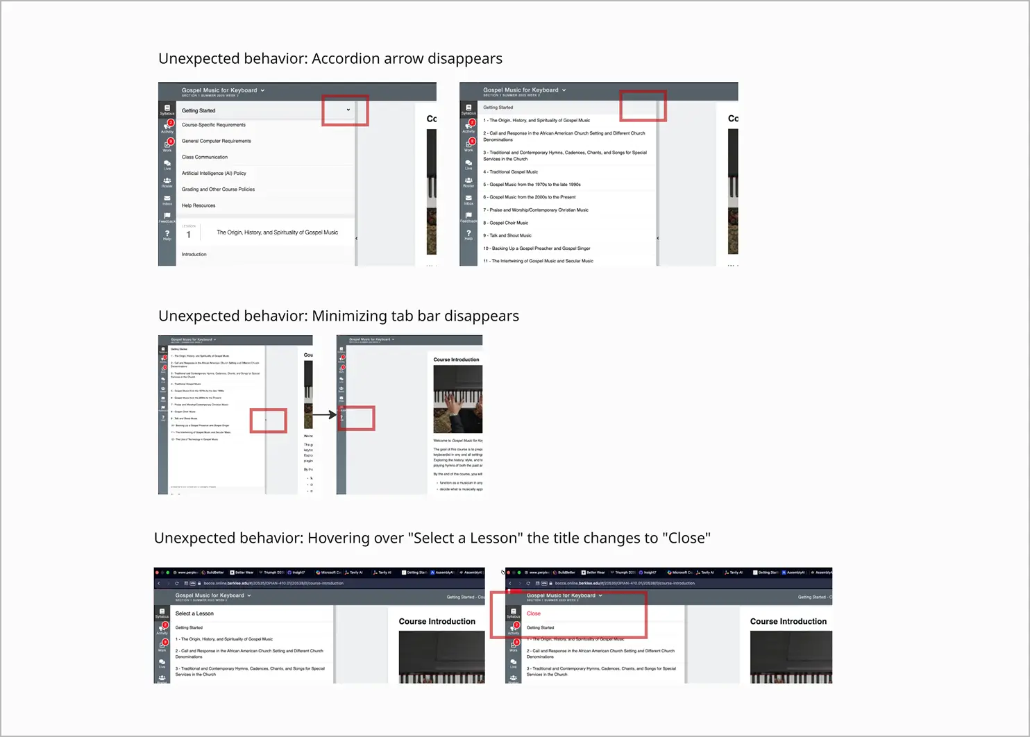
Over the years, their digital learning platform had evolved with a wide range of features and visual styles, creating both opportunities and complexity.

The client’s design team had already begun redesigning the platform and invited us to provide an external perspective, helping validate their direction and uncover new opportunities for improvement.

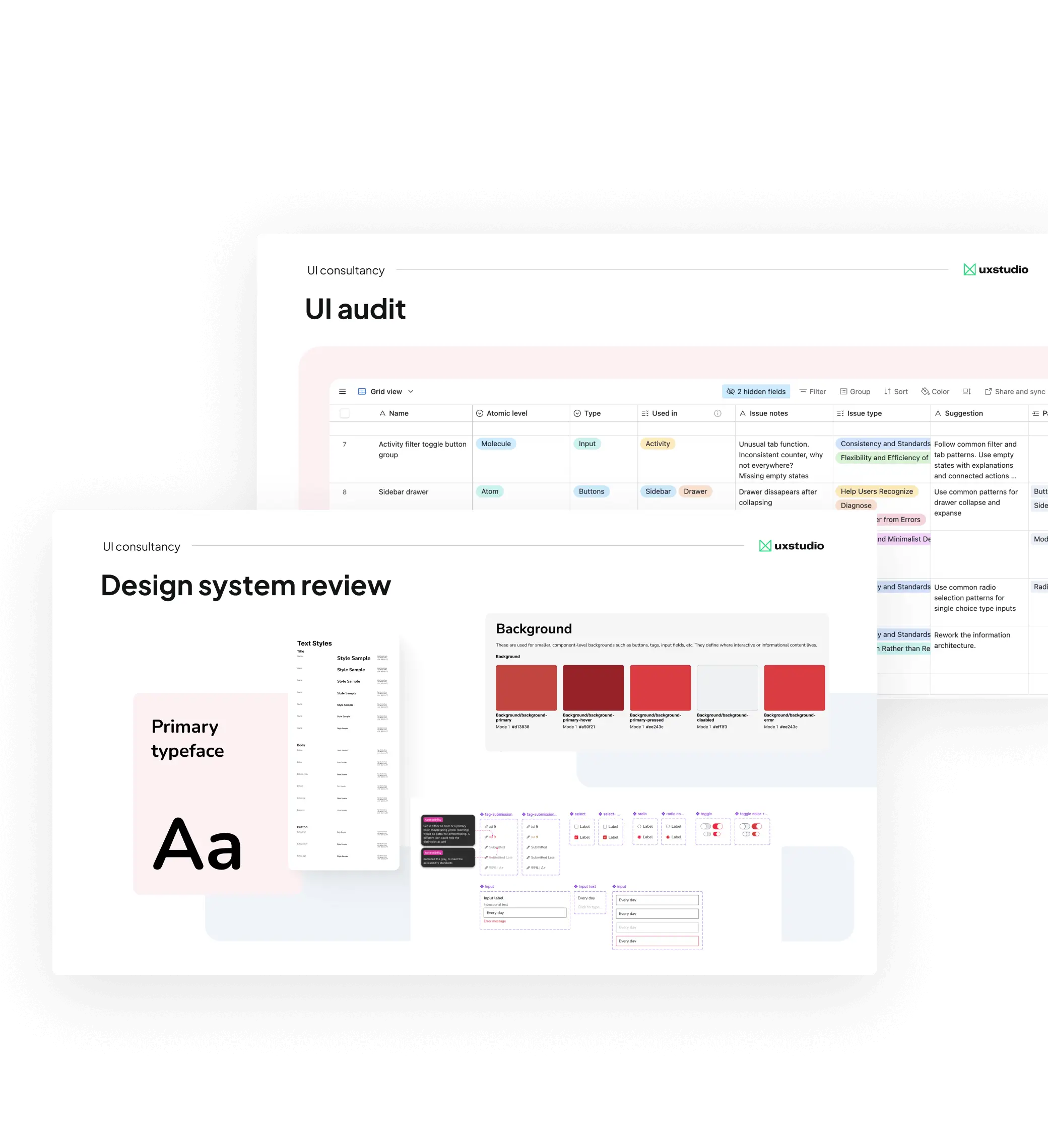
We joined their design team as consultants to synthesize findings, prioritize fixes, and set the foundations of a premium design system.

Outcome

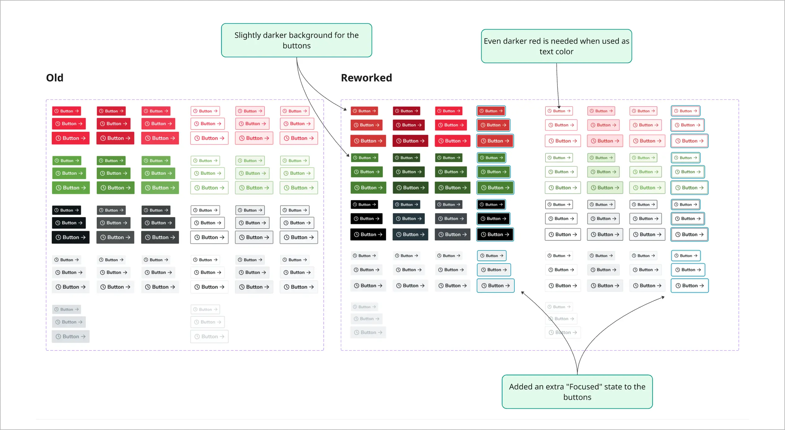
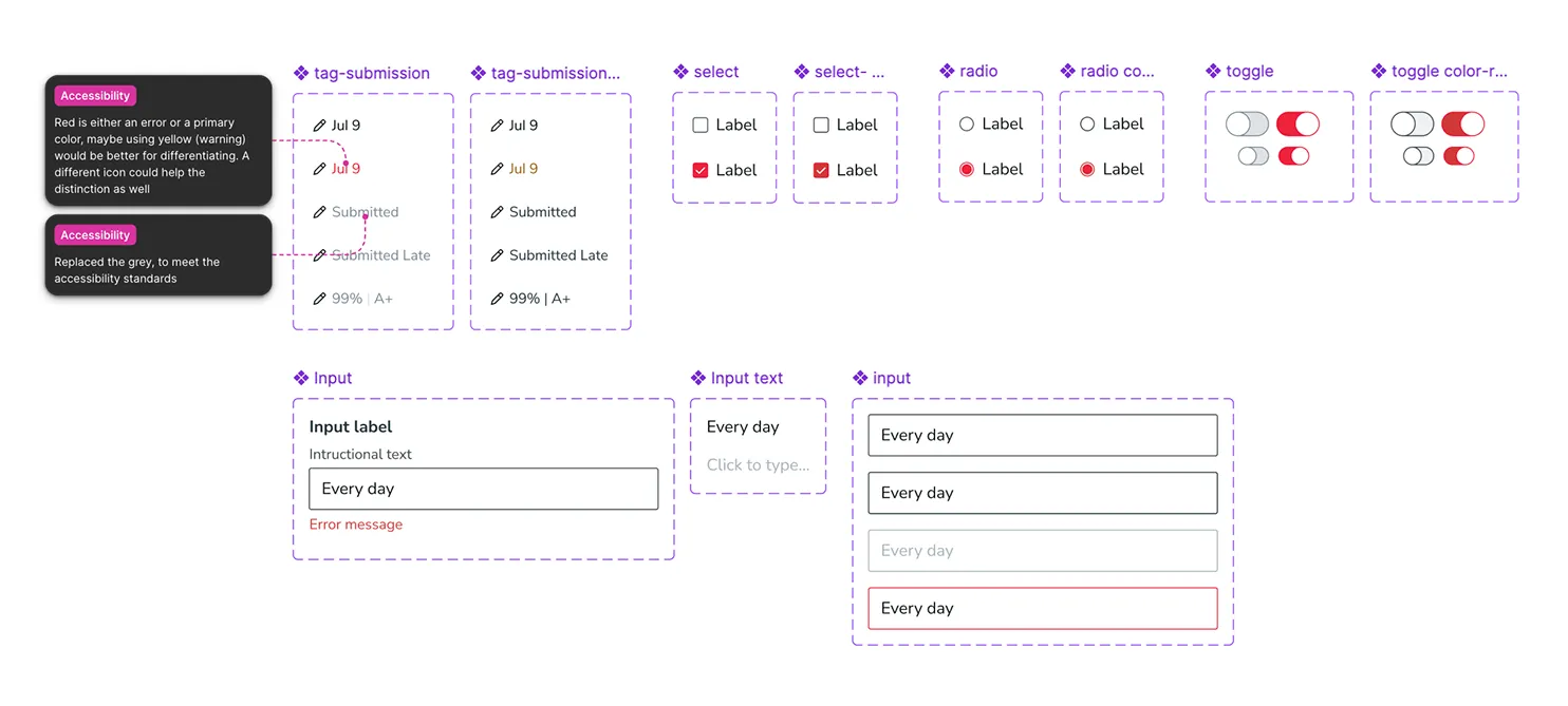
Instead of following a one-size-fits-all design system process, we tailored our method to meet the platform’s unique challenges.

Our flexible approach  helped build a design system that would stand the test of time and make future fixes faster and easier.

By adapting our methodology to the realities of the platform and client needs, we were able to deliver impactful improvements in a short period of time.

150+
UI inventory elements collected
7
strategic 
recommendations
Project timeline
Project timeline for UX / UI consultancy including expert review, analysis of existing research, design inventory.
1 /
UX audit & expert insights

The consultancy began with a structured UX and UI audit involving multiple reviewers to uncover foundational issues, such as:


  1. Inconsistent UI components and visual styles
  2. Confusing navigation, user flows and structural UX issues
  3. Overlapping functionalities
Screenshots from the report of the expert review.
One detail from the report we compiled following the expert reviews
2 /
Design system audit & component rework

The next step focused on strengthening the platform’s design foundation by creating a maintainable design system.

  1. Our UX consultants cataloged all existing colors, components, fonts, and styles from the live product using atomic design principles.
  2. We documented problematic patterns with best-practice guidance and "Do & Don’t" examples taken from the platform itself.
  3. We created a structured database with screenshots, usage context, and notes on component quality or issues.
  4. We rebuilt key UI elements for better consistency, accessibility, and flexibility.
The new, simplified design with 3D shapes as illustrations
One detail from the report we compiled following the expert reviews
3 /
Strategy & design

Beyond cleaning up UI, our consultant delivered strategic guidance to improve both design quality and long-term scalability.


This included:

  1. Establishing a design system  in Figma, including design token design, redesign and preparation; typography styles; and naming conventions.
  2. Improved accessibility by improving color contrast, adding focus states, and preparing components to meet minimum accessibility standards.
  3. Reviewed early-stage redesign screens, offering targeted feedback and suggestions for improvement.
  4. Provided architecture-level suggestions for long-term success.
UI kit elements
work with dedicated ux professionals
Get in touch
Schedule a call
Drop a message