Beyond “everything is important:” using MaxDiff in product research

There's a moment in almost every product research project where the team ends up staring at a long list of product features, ideas or user needs, all of which feel equally valid, and nobody can agree on what to explore first. If you've been there, read on.
Samson Ho, a UX researcher at UX studio, ran into exactly this problem on a project building a football app. He had done his qualitative groundwork, but there was no reliable way to figure out where to start prioritizing the 25 distinct user tasks that had emerged.
We sat down with Samson to unpack how MaxDiff helped him solve this issue, when to use it, and what it can reveal that simpler methods can't.
Traditional prioritization methods can be limiting
Before reaching for MaxDiff, Samson's team tried to think through the usual prioritization options, but he quickly realized their limitations.
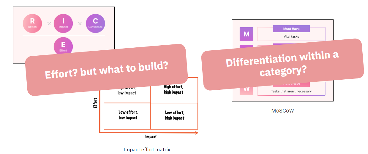
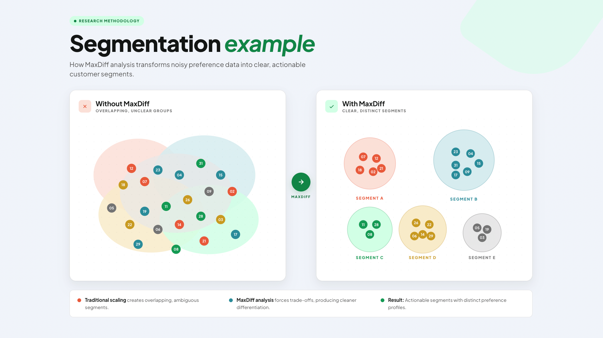
"Imagine UX studio wants to buy a software license," Samson explains, "and someone sends out a survey asking everyone to rank their priorities. On the surface, it makes sense. But then you realize that designers want designer tools, engineers want something completely different, and marketing has their own needs entirely. If you treat each group equally, the findings just average out, and that average doesn't represent anyone accurately."
There was a second problem too: sheer scale. Asking participants to rank 25 items against each other is cognitively brutal. After the first ten or so, respondents lose the ability to meaningfully distinguish between options.

A simple list of priorities wouldn’t be too helpful. Samson wanted to go deeper, and be able to compare how much more users prefer the first option versus the second, and whether that difference in magnitude was the same magnitude as the gap between number two and three.
The best method to capture these nuances was MaxDiff.
What is MaxDiff?
MaxDiff (Maximum Difference Scaling, sometimes called Best-Worst Scaling) has an elegant solution to avoid overgeneralisation and cognitive overload. Instead of asking participants to rank everything at once, it shows them a small set of items at a time and asks just two questions: What's the most important? What's the least important?

In practice, the survey Samson ran presented participants with a familiar scenario, and then asked them to work through 15 sets of five tasks, each time picking the most and least important. Each of the 25 tasks appeared at least three times across different combinations, giving the analysis enough data to build a reliable picture of each participant’s preferences.
To see what factors you need to consider to calculate the number of questions and items per question, we recommend Sawtooth’s MaxDiff calculator.
The items you put into a MaxDiff survey should be genuinely distinct from each other, and described in plain language.
It’s worth noting that while all 25 tasks Samson's team prioritized came from earlier research using a qualitative research methodology called mental model mapping, MaxDiff items can be based on assumptions.
Designing the survey itself
Once your item list is solid, the survey design decisions that follow are less glamorous but equally consequential.
1. Set a realistic scenario. Before participants start choosing, give them a concrete context to anchor their decisions.
2. Aim for each item to appear at least three times. The statistical analysis needs enough repetition per item to produce reliable estimates. The more each item appears, the more accurate the ranking is, but the trade off is that the survey will be longer, which may compromise the data quality.
3. Write all items at the same level of specificity. If some items are broad and others are granular, participants can't compare them on equal footing. The items should feel like they belong to the same universe of choices.
4. Pilot before you field. If you have the opportunity, a small pilot, even five or ten respondents, will surface items that confuse people, sets that feel impossible to choose between, and scenarios that don't land. It's much cheaper to fix these early.
How to analyze MaxDiff outputs?
So, you designed and ran your MaxDiff survey. Bad news: analysing the collected data is where things get tricky. Good news: this is where the real value lives.
Count analysis
The first pass is intuitive: count how many times each item was chosen as most important, subtract how many times it was chosen as least important, and rank accordingly.
But this simple count has a key limitation. It tells you nothing about individual variation, and it can't quantify how confident you should be in the findings.
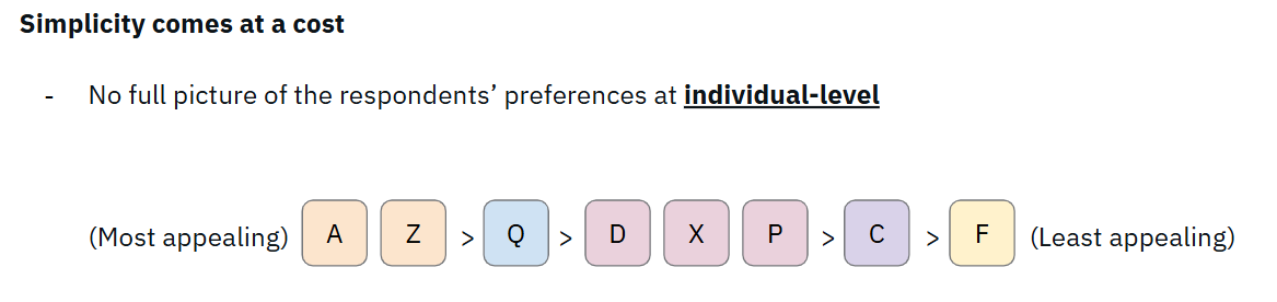
Because participants only choose from most/least pairs at each step, you are left with items that were never directly compared to each other. Also, when some items were presented together, respondents didn't need to rank them.
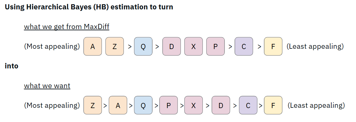
Bayesian hierarchical models
Using Hierarchical Bayes estimation, you can uncover deeper insights, something that count analysis cannot offer. By using the full pattern of each person's responses to simulate what their complete preference ordering probably looks like.
The result is a utility score of each item from each respondent, so you can see not just where something ranks, but how confident you can be in that rank.
Looking at the spread
When you plot every individual's estimated utility score for each item as a blue dot on the same chart, the spread tells you something the simple average cannot. Most items cluster tightly around the mean. But a few (e.g. task 24 on the illustration below) showed a very wide spread.
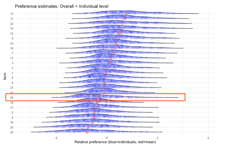
Their average utility scores (shown as red squares) were low. A straightforward read would say: not relevant, deprioritize. But the individual dots say otherwise. A small but distinct group of respondents valued this choice very highly, far above the average. This is a segment signal hiding inside an aggregated number. Without individual-level estimates, it could have been easily missed.
Clustering, aka finding the segments
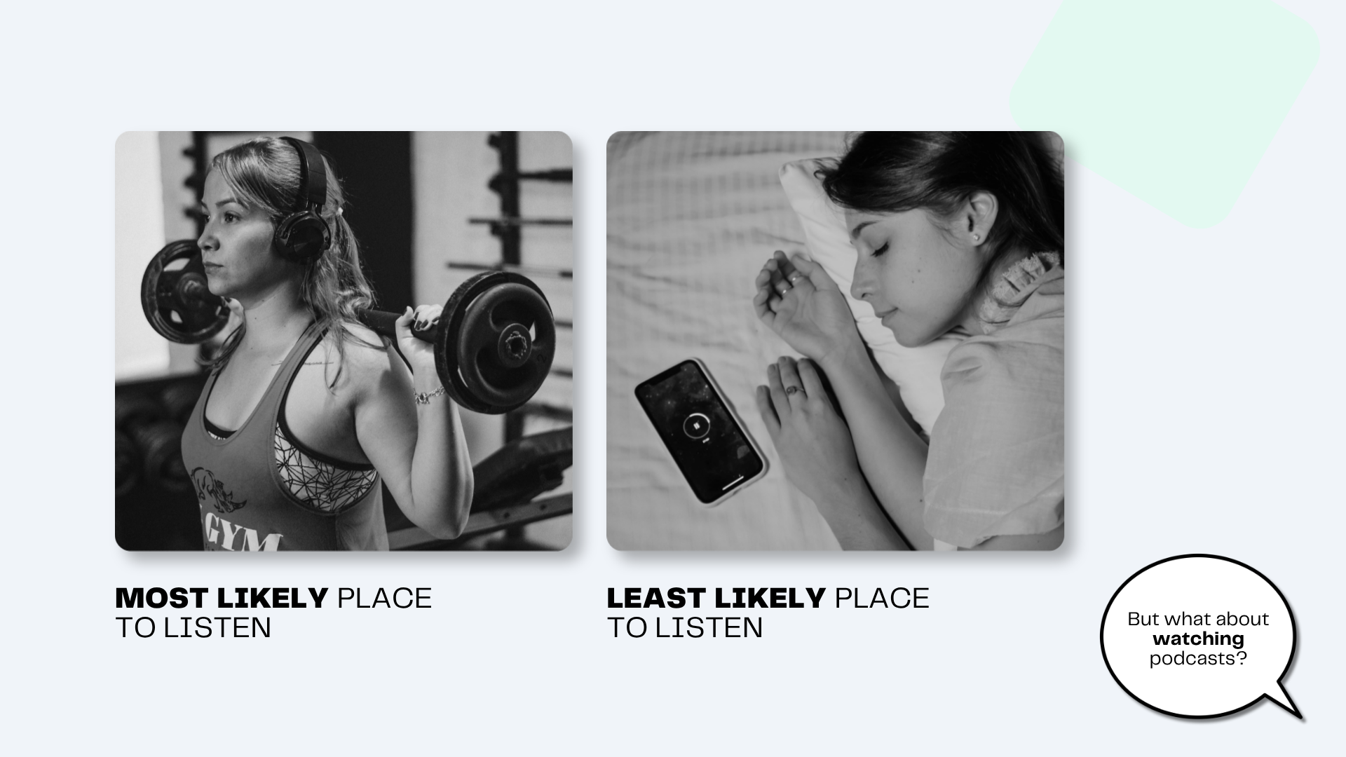
The analysis went further still. By looking at how preferences correlate across items (what other items do you also value if you value X?) the team identified four natural clusters of tasks. Since we won't reveal the actual research findings handed to our football client, let's turn back to our fictitious podcast fan example.

These clusters reveal how users' minds naturally group content.
Step 5: Further segmenting the respondents
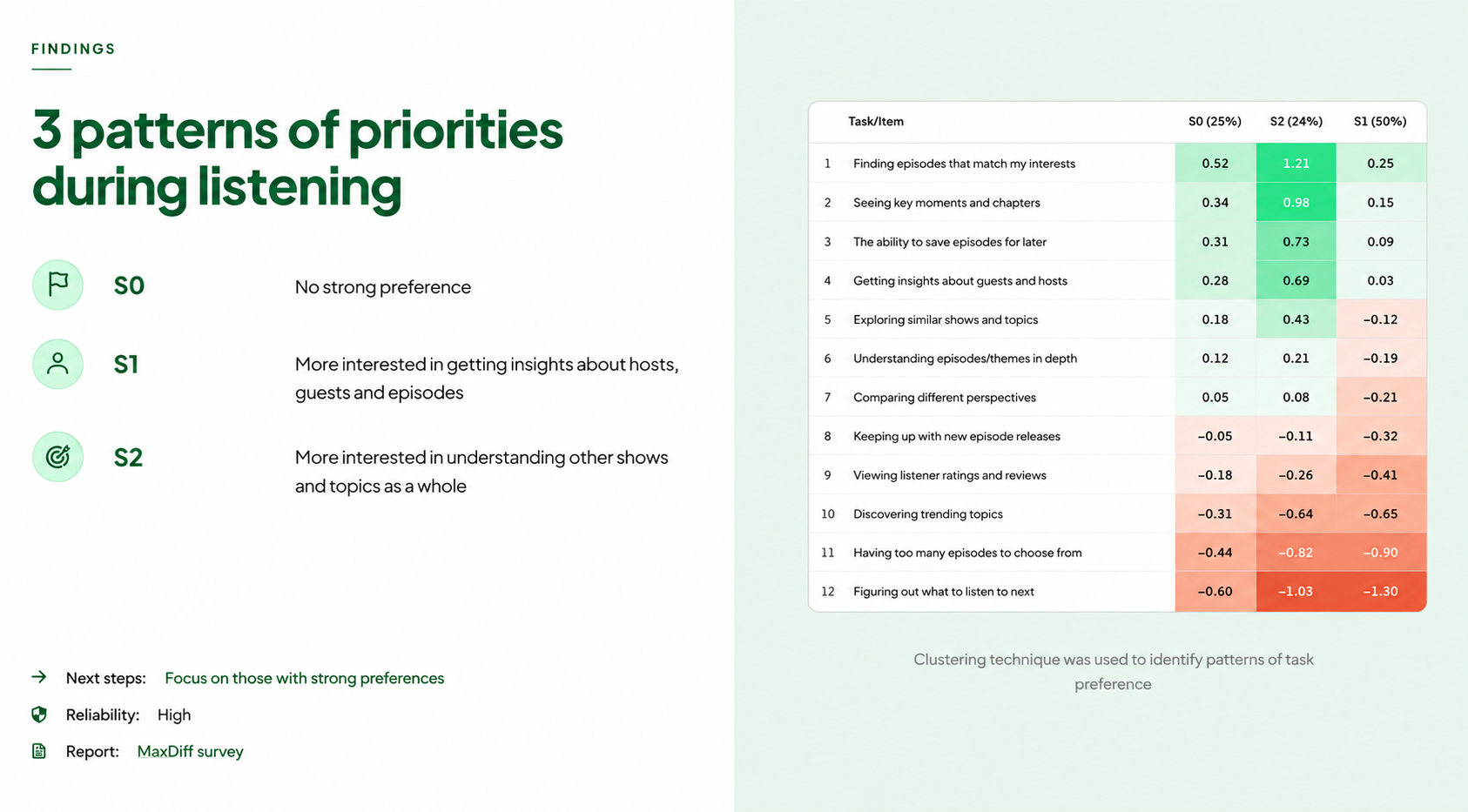
Using K-means clustering on the individual preference patterns, the team identified three distinct segments of respondents:
- Segment 1 (50% of respondents): No strong preference.
- Segment 2 (26%): Strongly prefers X.
- Segment 3 (24%): Strongly prefers Y.
Importantly, several tasks were highly valued across all three segments. These are the universal priorities, the safe foundation to build on regardless of which user type you're designing for.
+ Two advanced analyses worth knowing about
Beyond the segmentation approach described here, two other analytical techniques extend what MaxDiff data can tell you. Both are significantly more involved, but genuinely useful in the right context.
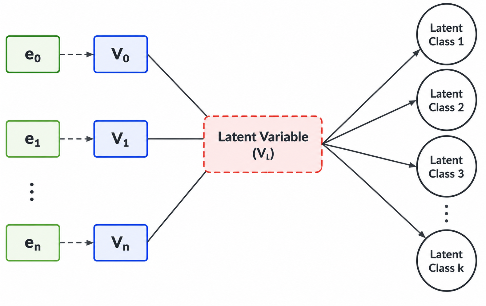
Latent Class Analysis
Latent Class Analysis is an alternative to Hierarchical Bayes estimation for segmentation. Where HB estimates individual-level preferences and then clusters respondents based on those estimates, Latent Class Analysis identifies segments directly from the pattern of choices.
This method finds groups of respondents who made systematically similar decisions, and characterizes each group's preference profile. For segmentation specifically, it's often considered the more rigorous approach.
TURF
Total Unduplicated Reach and Frequency solves a different problem entirely. Where the standard MaxDiff analysis tells you how strongly people prefer certain relative to the others, TURF focuses on identifying which combination of items would reach the most users.
This is particularly relevant when building a product with real capacity constraints (the number of X, e.g. features, choice). A feature that scores highly on average might serve the same audience as the second-highest feature, so building both gives you redundant coverage of one group while leaving another underserved.

Both analyses require either specialized software or strong programming skills, and can get expensive; but for teams working at scale, or making high-stakes prioritization decisions, they're worth knowing.
How to present findings without losing your audience
Ask Samson what happened when he first showed the full analysis to the design team, and he laughs.
"The designer looked at me and said, 'What are you doing? I don't understand any of this. Please simplify.'"
The lesson was straightforward: the analysis is for the researcher. The stakeholders need the takeaway.
So, lead with the insight ("here are the three things users prioritize most, and here are the two distinct types of users we should design for") and keep the methodology in an appendix for anyone curious enough to dig in. The charts and confidence intervals are tools for reaching the conclusion, not the conclusion itself.
When should you use MaxDiff?
Samson's rule of thumb comes down to three situations:
1. You have a large item list. Traditional ranking will produce unreliable data from cognitively exhausted participants. MaxDiff is built for scale.
2. You know your users aren't one homogeneous group. They may have some hidden variables that help explain their preferences. But if different segments value different things, a simple survey average will mislead you. MaxDiff lets the segmentation emerge from the data rather than forcing you to define it upfront.
3. You need to understand not just rank, but distance. Knowing that Feature A is ranked above Feature B is useful. Knowing that A and B are nearly equal, and both are far ahead of everything else, is actionable. You can run HB estimation using the MaxDiff data, which will give you more useful insights about the ranking.
What to consider when using MaxDiff
The method has real limitations, and Samson is candid about them.
- The analysis is genuinely difficult. You either need solid statistical chops and programming ability, or a specialized tool built for this type of survey. The complexity is baked in.
- There's also a scope question. MaxDiff tells you what matters to users, not why. It's excellent for quantifying priorities once you have a well-grounded item list, but it should follow qualitative research.
- And practically: the more items you include, the more question sets participants need to complete. Even committed respondents face meaningful cognitive effort. Survey design needs to account for this. Explore the different types of MaxDiff, which were designed for different scenarios, and make sure you understand their tradeoffs and requirements.

Going deeper: there's more to MaxDiff than one variant
If you've followed the method this far and you're thinking about applying it seriously, it's worth knowing that "MaxDiff" isn't a single fixed technique but a family of approaches, and choosing the right variant matters.
The standard version Samson used works well for most product research contexts, but depending on how many items you need to rank, your sample size, and whether you need robust segmentation, there are alternatives worth being aware of.
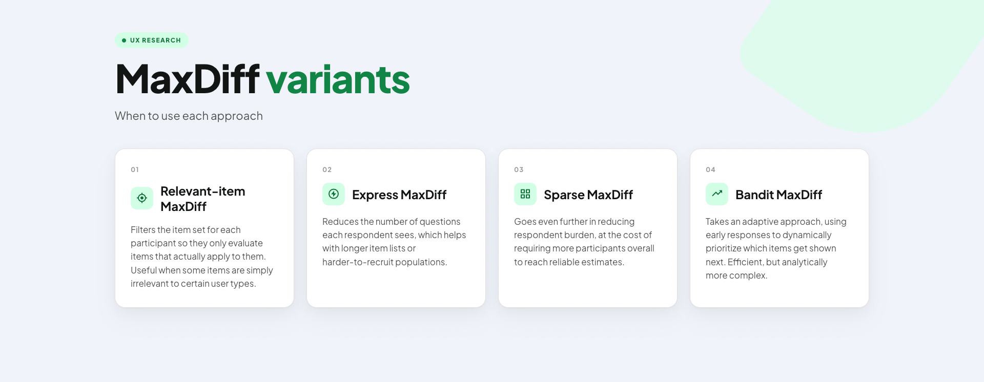
The right choice depends on three things:
- how many items you're ranking,
- how large your sample is,
- whether your primary goal is segmentation /discovering latent variables to better understand the rankings.
None of these variants change the fundamental logic of the method (forced best-worst choices, individual-level preference estimates) but they shift the trade-offs between respondent effort, sample requirements, and analytical confidence.Don't be afraid to pick-and-choose the one(s) that fit your project constraints best.
Checking whether your data is actually trustworthy
One thing that often goes unmentioned in introductions to MaxDiff is that the method has its own data quality checks.
A popular approach is RLH (Root Likelihood), a measure of how well the statistical model fits each individual respondent's choices. A low RLH suggests a respondent was answering randomly rather than genuinely, which can happen with participants who’re not heavily engaged.
We can refer to this disengaged group of respondents as speeders: respondents who completed the survey implausibly fast. A 15-question MaxDiff survey takes real cognitive effort; if someone finished in two minutes, their choices almost certainly don't reflect genuine preferences. Identifying and removing speeders before analysis is a basic quality step that's easy to skip and costly to ignore.
Goodness of fit is a broader model-level check. It seeks to answer how well the estimated preference model actually accounts for the observed choices across all respondents. Poor goodness of fit doesn't necessarily mean the data is bad, but it's a signal that respondents’ choices may be more arbitrary. This is worth investigating, as it could result from poorly worded items, too many questions, high cognitive load, or simply low-quality respondents.
Remember that nothing compensates for poor data quality, so it’s vital to get recruitment right: you need high-quality participants through a well-designed screener.
The bottom line
MaxDiff is one of those research methods that seems overcomplicated until you face the problem it was designed to solve.
Maxdiff won't tell you everything. But it will tell you, with statistical confidence, what to build first, and for whom.
Need a hand to get started with MaxDiff, or other UXR methods? Get in touch with UX studio and work with academically trained researchers.
Credits
Samson Ho is a UX Researcher at UX Studio. The project referenced in this article involved building a football app experience; client details have been anonymized. The interview was conducted by Dr. Johanna Székelyhidi, marketing manager and copywriter.