How to stand out in the UX hiring process: what we look for

During our last UX designer hiring round, we received 292 applications and reviewed 166 UX portfolios. What may surprise you is that only eight candidates were invited to an interview.
If you are wondering how that happens, the short answer is this: the majority of UX portfolios leave a lot to be desired. Small signals in formatting, storytelling, visual consistency, and communication quickly separate strong candidates from the rest.
In this article, we walk you through exactly how we review UX portfolios, what we pay attention to in case studies, how we evaluate candidates during interviews, and what ultimately drives our hiring decisions.
Along the way, you will find practical tips you can use to sharpen your application and show up stronger in the process.
Where portfolio review fits in the process
Hiring processes vary across companies, but the later stages tend to be similar. Once you pass the initial screening, the real evaluation usually takes place during portfolio and case study reviews, followed by the interview and live presentation.
These stages reveal how a designer thinks, communicates, and prioritizes, far more than a resume could ever.
UX portfolio format: the first impression happens fast
Before we open your portfolio, its format already sends a signal. We’re typically scanning many applications under time pressure, so anything that slows comprehension works against you.
The strongest impression usually comes from a dedicated portfolio website hosted on your own domain. It communicates seriousness and makes our job easy. Portfolio websites are the standard for a reason: they are easier to manage, navigate, and review.
By contrast, portfolios delivered as PDFs, shared folders, or raw Figma files often create unnecessary friction, mostly because of their navigation. Community platforms like Behance or Dribbble can be useful for visibility and UI showcase, but they are simply not made to present in-depth UX case studies.
The format alone will not secure you an interview, but it can weaken an otherwise strong application right at the initial stage.
Aesthetics: what we notice immediately
Once your portfolio is opened, visual assessment begins right away. It’s important to know that not everyone reviewing your work is a designer. Recruiters, product leaders, and executives all form opinions, and they rely heavily on overall clarity and cohesion.
A portfolio is one of the few products you can create without stakeholder constraints. Because of that, it becomes a very honest reflection of your taste and decision-making.
Why minimalism is the safest starting point
When aiming for broad appeal, minimalism consistently performs best. It reduces cognitive load, avoids polarizing stylistic choices, and lets the work speak clearly. Personality and visual flair can absolutely be layered in, but starting from a clean foundation tends to create the strongest first impression in a UX portfolio.
Consistency is the real differentiator
What matters most is not visual complexity but consistency. Strong portfolios demonstrate systems thinking through repeated patterns and disciplined choices. This basically translates to a design system that your portfolio is built on.
We pay close attention to whether you maintain a cohesive color palette, a clear information hierarchy, and consistent typography. Imagery should feel harmonized rather than randomly assembled. Case study thumbnails should look like they belong to the same family.
Even reviewers without formal design training can sense when something feels coherent versus scattered: consistency communicates maturity and attention-to-detail.

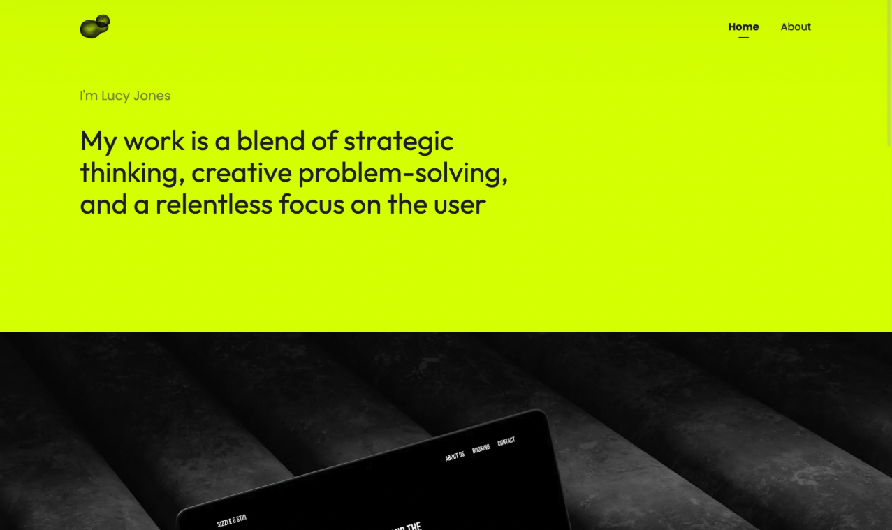
The hero section: clarity is key
The hero section in UX portfolios is often overdesigned. Many designers try to be overly witty or visually impressive, which frequently results in clutter and bad UX.
The most effective hero sections are straightforward. They clearly state your name and your actual professional role. Titles like “UX Designer” or “Product Designer” are far more useful than vague labels such as “design unicorn” or “creative designer”.
A short tagline should explain what you do, your focus or experience level, and your general approach to design. The goal is not to entertain but to orient the reader quickly.
Certain elements tend to work against you. Oversized personal photos, elaborate cursor effects, and heavy autonomous animations often distract from your work and can signal misplaced priorities for a UX role. Subtlety and clarity usually win.

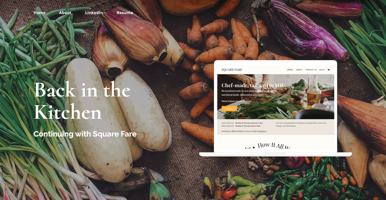
Case studies: where serious evaluation begins
If the initial impression is strong, we move on to review your case studies. Because we typically assess many portfolios in a limited time, we’ll open two projects. This is why careful curation matters. Three well-chosen case studies are usually sufficient. A large number of projects can sometimes suggest difficulty curating or editing your own work.
The first scroll matters more than expected
Before reading in detail, we quickly assess how the case study looks. Visual consistency, alignment with the overall portfolio, and apparent length all influence whether we continue reading attentively.
Case studies that appear excessively long or visually dense often lose attention early. In many cases, a focused narrative of around five to six hundred words is more effective than an exhaustive document.
What makes a strong case study
Strong case studies make your reasoning visible. We are not just looking for polished screens; we are looking for evidence of structured thinking.
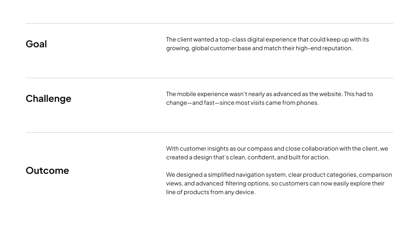
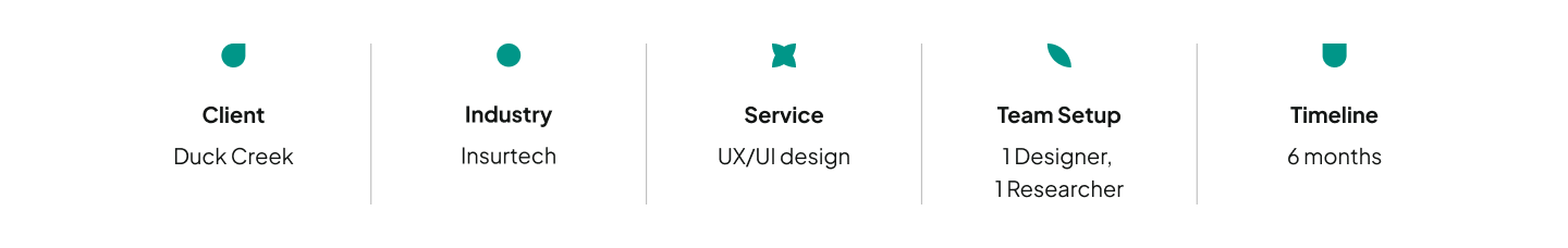
1. Start with clear context
At the beginning of the case study, we expect to quickly understand the scope of your project. The timeline, team setup, your specific responsibilities, and the delivered outcomes should all be easy to find. When measurable impact is included, it significantly strengthens credibility.

2. Show the thinking, not just the outcome
As we read, we are trying to reconstruct your decision-making process. We want to understand what you did, why you did it, what constraints existed, and how the solution evolved over time. We look for signs of iteration, trade-off awareness, and validation. Not every step needs exhaustive detail, but the logic behind key decisions should be visible.
3. Break up the narrative
Dense text slows reviewers down and reduces comprehension. Effective case studies use visuals to support the story and provide natural reading breaks. Screens, diagrams, and artifacts should feel purposeful rather than decorative.
4. Mention the user
One subtle but important signal is how often the user is referenced. When the word “user” rarely appears in a UX case study, it raises immediate concerns about the designer’s focus.
The interview: communication under real conditions
We hire designers not only for craft but for their ability to align teams, explain decisions, and drive product outcomes. The interview reveals whether the candidate can verbally construct a coherent case for their work.
During the interview, you might be required to present one of your past projects. If the choice is yours, make sure to present a project that was included in your portfolio. This will benefit you in manyfold ways:
- Both you and your audience will have some familiarity with the project.
- You can screen-share your portfolio and use it as guidance.
The most effective presentations walk clearly through the problem space, the business and user context, the exploration process, and the reasoning behind final decisions. We pay close attention to how candidates discuss discarded ideas, constraints, and feedback loops.
Communication style matters as much as content. Designers who can explain complex decisions in a structured, calm, and persuasive way tend to stand out quickly.
Signals we watch during the interview
Beyond the project itself, several behavioral signals strongly influence our perception.
We notice whether you express genuine opinions about your work and whether those opinions are supported by reasoning. We also observe how you handle questions, especially unexpected ones. Thoughtful pauses to gather your ideas are usually positive signals, as they indicate deliberate thinking rather than reactive answering.
How you discuss previous teams and projects also matters. Professionalism and respect, even when describing challenges, suggest strong collaboration skills.
Perhaps most importantly, we watch how candidates respond to feedback. Defensiveness is a concern. Curiosity, openness, and thoughtful follow-up questions are strong positives.

How the final hiring decision is actually made
From our side, bringing someone on board requires significant time, effort, and coordination. The process often starts weeks or even months before the interview stage, and once we hire you, we invest heavily in onboarding, team integration, and ongoing feedback. Because of this, we aim to make the strongest long-term decision rather than a quick compromise.
This means that the final decision is rarely about one single factor. We evaluate the entire application package: the portfolio, the presentation, the communication style, and the overall preparedness shown throughout the process.
We ask whether your strengths align with the team’s mission and whether your weaker areas appear coachable. We consider whether we would trust you to collaborate constructively with the team and represent the product well.

There is also an intuitive layer. As leaders, we ask ourselves whether we would genuinely want to work with you and whether any unresolved concerns remain.
If confidence is high, we move forward and handle the logistical details afterward. If meaningful doubt persists, the process typically restarts, since we don’t believe in compromise hires.
Takeaways
Strong UX designers rarely succeed by accident. The portfolios that stand out tend to be clear, consistent, and thoughtfully curated. The interviews that convert offers usually demonstrate structured thinking, strong communication, and professional maturity. When these elements align, the hiring decision becomes much easier for us to make.
Credits
This blog post was written by Akor Izsak, product lead
Editing by Dr. Johanna Székelyhidi, marketing manager and copywriter