What we learned designing an unconventional AI assistant
.webp)
When we started building Brandi, Copyfolio's AI branding assistant, we ran into a problem pretty quickly: barely anyone had done this kind of thing before.
Not the AI part, but the interface: how do you design a chatbot that doesn't just talk at you, but actually builds something together with you? How do you create valuable AI output that makes you want to invest the time in? And how do you fit a brand-building experience into a product that was originally built to be a website builder?
We figured it out eventually, so here's the story of how Brandi came to life and what we learned in the process.
Why Brandi exists
Copyfolio by UX studio helps copywriters and marketers build their portfolio websites quickly and easily, but any great freelance website needs a real, unique personal brand behind it: a USP, a tone of voice, and a brand personality that runs through everything.
After an extensive research round, we found that most of our freelancer users didn't really have a personal brand at all. Without a clear sense of what they stood for and who they were targeting, building a consistent online presence was nearly impossible, not to mention finding the right clients.
We didn't want Brandi to be the kind of tool where you just fill in three bullet points and get a brand kit back. Instead, you spend about ten minutes with it, answering real, sometimes uncomfortable questions, and the output reflects that. What you get isn’t just a pretty color palette, but a clear USP describing your value as a professional, and guidance on how to communicate it, which past projects to highlight, and how to show up consistently online. Basically, Brandi helps you put into words what makes you you.
Brandi’s life story
Before Brandi was a full-grown chat, it was a toddler, aka a guided questionnaire. You'd go through a set of questions, fill in your answers about what makes you unique and how you want your tone to sound, and your brand assets would be ready at the end. Overall, users liked it, but we felt that the output was too generic: the assets didn't talk to each other, and there was no room for proper follow-up.
We needed better user input, a need which pushed us toward rethinking the whole process as a conversation, where Brandi could actually respond to what you said, tailor the questions to your needs, and dig deeper when your answer was too vague. But if the entire brand builder is just a chat, where do your brand assets live and how do the two connect?
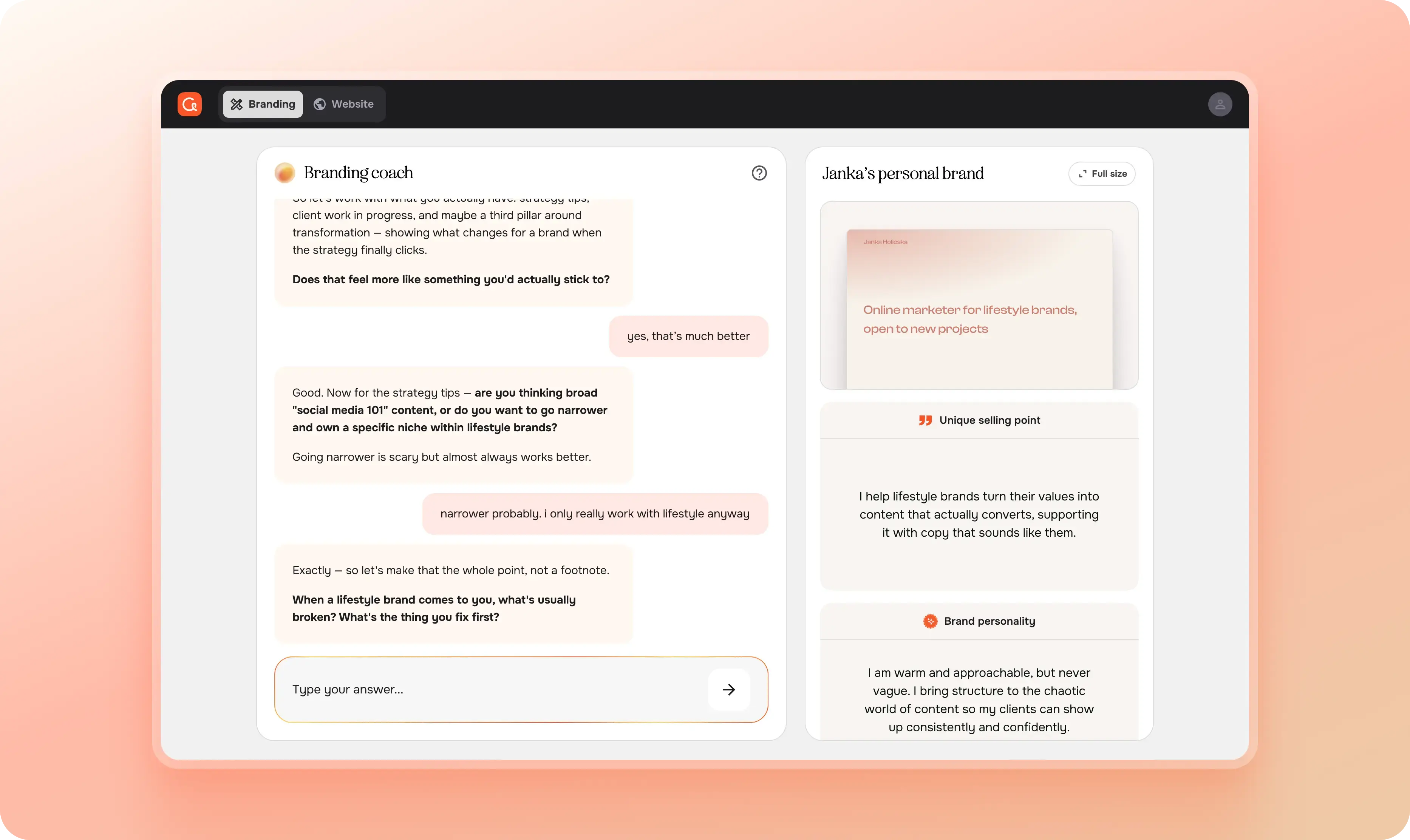
Why a chat+sidebar interface
The most common AI chat pattern is quite straightforward: you ask something that you can’t be bothered to Google, the AI responds, and the response disappears into the thread because you haven’t opened a new chat in four months. But Brandi doesn't just generate a brand for you, it makes you build it yourself as the conversation moves forward.
So we introduced a sidebar next to the chat where your brand assets live: your USP, brand personality, tone of voice, content pillars, each in its own container, in a fixed order, filling in as you go. The main challenge here was that there weren’t many chat-plus-output UIs on the market yet to draw inspiration from, and the ones that existed were mostly made for engineers: the exact opposite in tech-savviness to Copyfolio users, who are mainly marketers, copywriters and content creators. We had to simplify the interface a lot to keep it as friendly and intuitive as the rest of the product.
Getting there took a few wrong turns though. At different points we had iterations where the assets lived below the chat in a bento grid layout, on a separate tab, on a different page, but the same thing happened each time: the connection between Brandi and the created brand assets was gone, so basically, the chat+sidebar layout turned out to be functionally essential.
How to make users intrigued about a chat interface
A challenge with the chat+sidebar interface was that at first glance, it was genuinely too much to look at, and we also saw this in the numbers. The biggest drop-off happened before the users even started to chat with Brandi, but once they did, more than 60% defined their three main assets.
We quickly realized that the issue lied in how Brandi loads for the very first time, and not necessarily the UI itself. Looking back, it honestly makes sense: users don’t even know why they’re there yet, but there were multiple messages in a chat, and the input field was glowing in orange, and there was an empty, disabled-looking sidebar on the right. Not exactly inviting. We just didn’t notice this, because we got used to it and to us, it made perfect sense. This is why user interviews are so important.
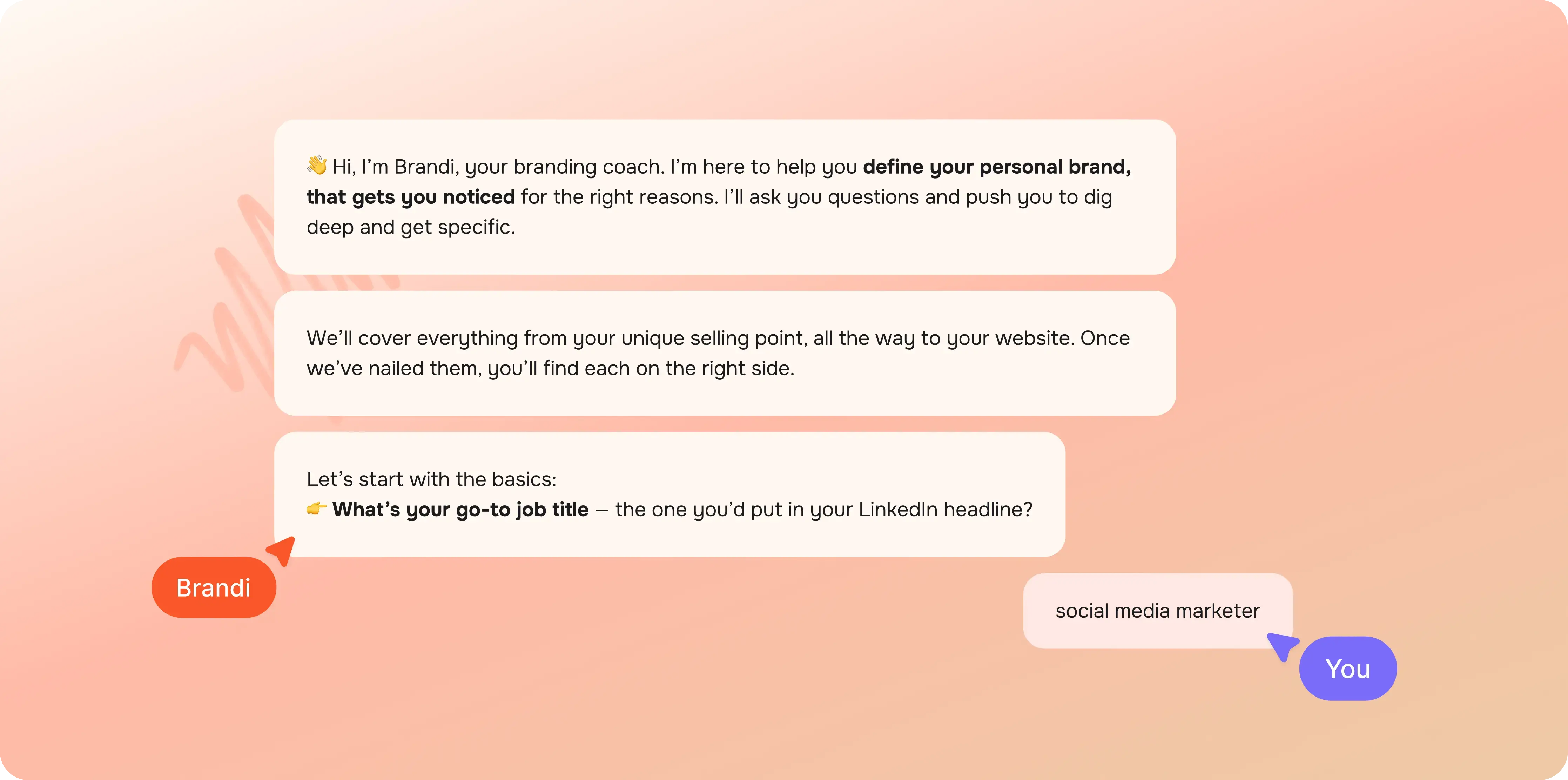
To solve this, we decided to introduce a less conventional, animated “onboarding tour”. Brandi would introduce itself and tell the user about the goal and the output of the chat. Meanwhile, related UI elements started to appear as Brandi was talking about them. At the very end, the input field started to glow, indicating that it was the user’s turn . This was all happening on its own, without the users having to press a single button, and since this was quite unusual, everyone paid attention.
How to indicate progress in a never-ending chat
One of the trickier findings from user tests turned out to be progress indication. Users could see the sidebar filling up, but they didn’t necessarily identify that as progress–yet they still wanted to know how far along they were in the brand building process. The obvious answer, a percentage bar or a step counter, didn't really work, because the same brand can take three messages to define or fifteen, depending on how much someone has to unpack.
We landed on estimating at the asset level rather than the conversation level. Each container in the sidebar has a simple line along the bottom that fills as that particular asset gets closer to being complete, like a quiet visual cue that something is moving forward.
Fun fact: Brandi actually estimates the progress itself based on the user’s answers, so it’s quite accurate. (We also used Brandi to debug itself once it was acting up. Think about this the next time you’re building an AI assistant.)
Why Brandi’s ‘personality’ was the key to everything
Most AI tools are relentlessly positive. You write something that even a second-grader could think about and it will say you’re a genius and validate whatever direction you're heading in. Sean Goedocke calls this behavior the first LLM dark pattern.
So, this doesn’t really work when you’re really trying to build a unique personal brand that will help you target the right clients.
This is why we built Brandi to act more like a sharp big sister: someone who actually wants what's best for you, which means she'll push back when your answer is too safe, and she won't let you get away with "I'm passionate about my work" as a USP.
This turned out to be one of the biggest differentiators during user testing. At first when people opened it, they weren't particularly excited; it was just another AI chatbot. But two minutes in, once it started asking the harder questions, you could see users lean into their screens. This proved that Brandi wasn’t just another yes-machine, but actually pushed back and tailored its questions to the user. The reaction that stuck with us most was someone saying “I wish I had asked myself these questions before I started freelancing.”
This took quite a bit of trial and error with the system prompt. You can learn more about how to build a great system prompt on our blog.
Why tool calls changed the game
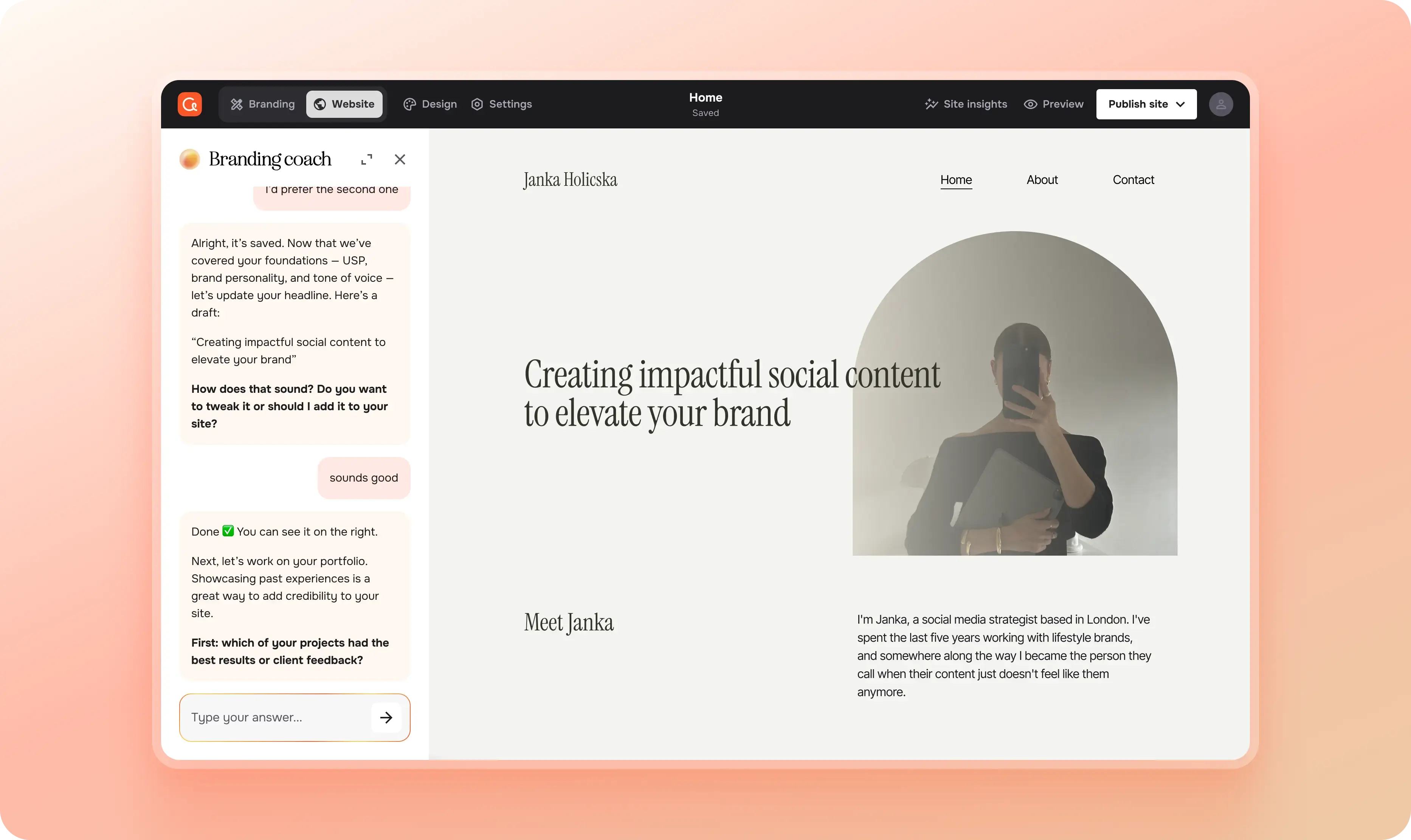
Once we figured out that we could write simple tool calls that would trigger real actions, like applying colors to the website using the same logic as the existing website builder, adding case studies, selecting font families, or adding sections, the scope of what Brandi could do expanded a lot, and the work moved surprisingly fast, even in a tiny, 5-person product team like Copyfolio’s.
The biggest challenge was figuring out what this should actually look like for the user. We landed on a small card that appears in the chat thread whenever Brandi makes a change, telling you what was updated. Clicking it opens the relevant part of the editor: your live color palette, or the section that was just added. During those moments, Brandi shrinks into a slim sidebar while you explore the change, then expands back when you return to the conversation. It keeps the session feeling continuous.
Getting the timing of tool calls right took a lot of prompt engineering, though. The intended way was that they'd fire either automatically at the right moment in the conversation, or in response to something the user asked, but sometimes they'd get confused and trigger at the wrong time, or multiple would trigger at the same time. Structuring the prompt carefully helped a lot, and switching to a more capable model eventually sorted most of the remaining issues.
One thing we learned though: it's really best if one person owns the system prompt. Once it gets to a few hundred lines long, it becomes a lot like a codebase, so having multiple people working in it without a shared structure creates problems that are surprisingly hard to trace back.
Where does a brand builder live in a website builder
Copyfolio was built as a website builder, so there was no obvious place in the information architecture for a full chat interface.
The floating chatbot in the corner was immediately off the table for two reasons: it would look like a support widget, which would completely undermine what Brandi was meant to be, since we wanted it to feel like a serious, primary feature with its own dedicated space rather than something tacked onto the corner of a page.
We ended up building a view mode switch where users can toggle between "Website building" and "Branding" modes. In Branding mode, Brandi gets the full page. When it's actively modifying your site, it contracts into a sidebar, but even then, it's integrated into the interface, not floating above it, so it never loses that sense of being a proper part of the product.
What we'd tell ourselves if we were starting over
Building Brandi taught us more about building with AI than anything we'd done before, and a lot of it was trial and error. Figuring out prompt engineering, choosing the right model, and finding patterns that nobody had written up yet. Now looking back, here are few things we'd tell our past selves:
- Don't underestimate the small things. A typewriter animation or a progress line didn’t feel like huge additions at the time. But they make up a lot of what made users feel like something meaningful was happening and helped make a general chat interface more exciting.
- Don’t be afraid to invent new patterns if no existing ones fit your needs. If pinning a message in a chat is not prominent enough to save it, get a notebook, and start sketching as many possible solutions as you can. One will work eventually.
- Tool calls are a design problem as much as an engineering one. How a change gets communicated, how the user can get back to it, how the interface adjusts around it, all of that needs to be designed deliberately.
- And if nothing else: treat the system prompt like production code. One owner, clear structure, and, ideally, a way to version it.
Designing something from scratch while having no prior examples to reference obviously makes the design process more challenging than usual, but you really just need to apply the same principles as when you’re designing any other feature: the user should always know where they are, what can they do there, and what should be their next step.
Credits
This blog post was written by Janka Holicska, product designer
Editing by Dr. Johanna Székelyhidi, marketing manager and copywriter