How to build a successful SaaS onboarding flow: 4 great examples

Onboarding is one of the major places in a SaaS product where good design has a direct and measurable impact on revenue and retention. Done well, it turns sign-ups into confident, returning users. Done poorly, it loses them before they've had a chance to experience the product's value.
In this post, we look at top SaaS product onboarding examples, the principles that make them work, and what product managers and designers can take from each one.
What is SaaS onboarding and how does it drive retention?
SaaS onboarding is the guided process that gets new users to sign up and feel confident to use your product. It serves two purposes: for product teams, it's an opportunity to learn about user behavior, goals, and friction points. For users, it should make the product's value clear and get them to their first meaningful win.
At its core, good onboarding follows a simple process: acquire → onboard → activate → retain.
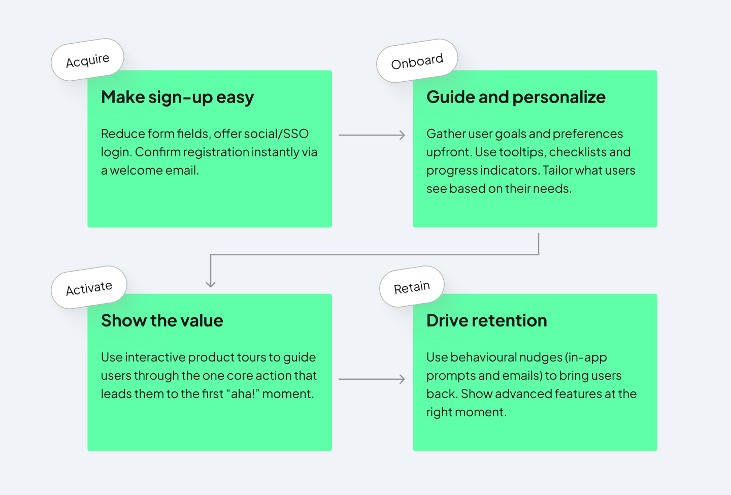
For many SaaS product teams, onboarding is treated as something to fix later, once the core product is stable. But retention starts the moment a user signs up. People arrive with a specific problem in mind and a short window of patience. If they don't find value quickly, they leave.
This makes onboarding the make-or-break stage in SaaS. According to a 2026 Optifai study, 70% of churn happens in the first 90 days, which shows how important the early experience is.
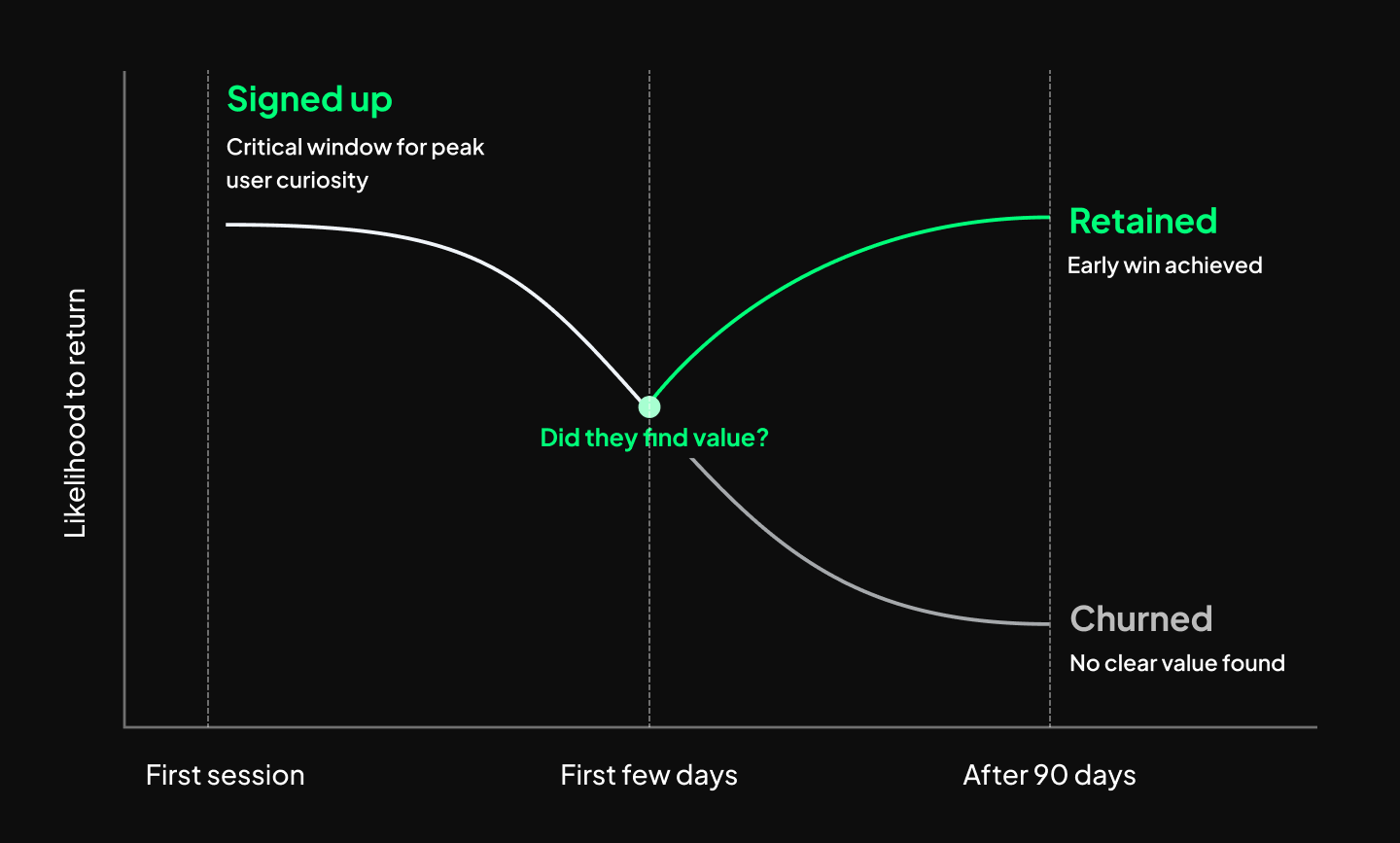
SaaS onboarding drives retention by helping users reach value quickly, so they understand why the product matters and have a reason to keep using it. A strong onboarding flow reduces confusion and friction early on. Let’s look at examples of companies that get it right.
4 of the best SaaS onboarding experiences
These are some of our favorite examples of onboarding flows in SaaS products that just get it right. They’ve considered small details and ways to personalize the experience for your users.
- Loom
- Typeform
- Grammarly
- Copyfolio
Loom: tailoring to specific user needs
Loom uses self-referential onboarding in the best way. It uses video to teach users how to use a video tool, which surfaces the product's value before a user has recorded anything. Here are some standout aspects of the process:
Getting the user’s role upfront
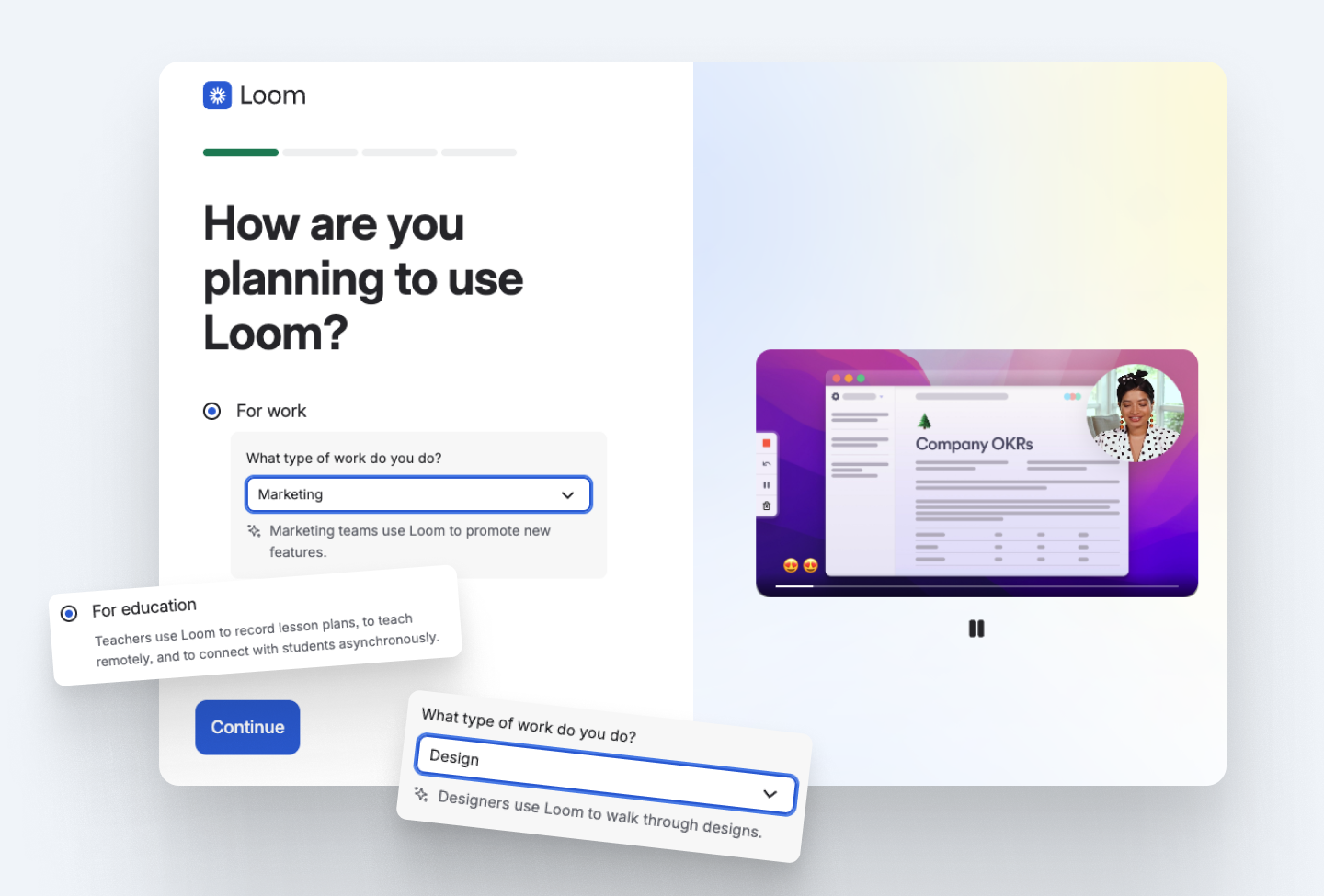
The first thing users are asked is how they plan to use the tool. The Loom team gathers user segment data quickly, and users receive hint texts with use cases for any role they choose.
A nifty trick Loom uses in the dropdown is not alphabetizing user roles. Randomizing the order overcomes the issue of users who want to get through the process quickly by simply selecting the first option.
Letting users try the product from the second step
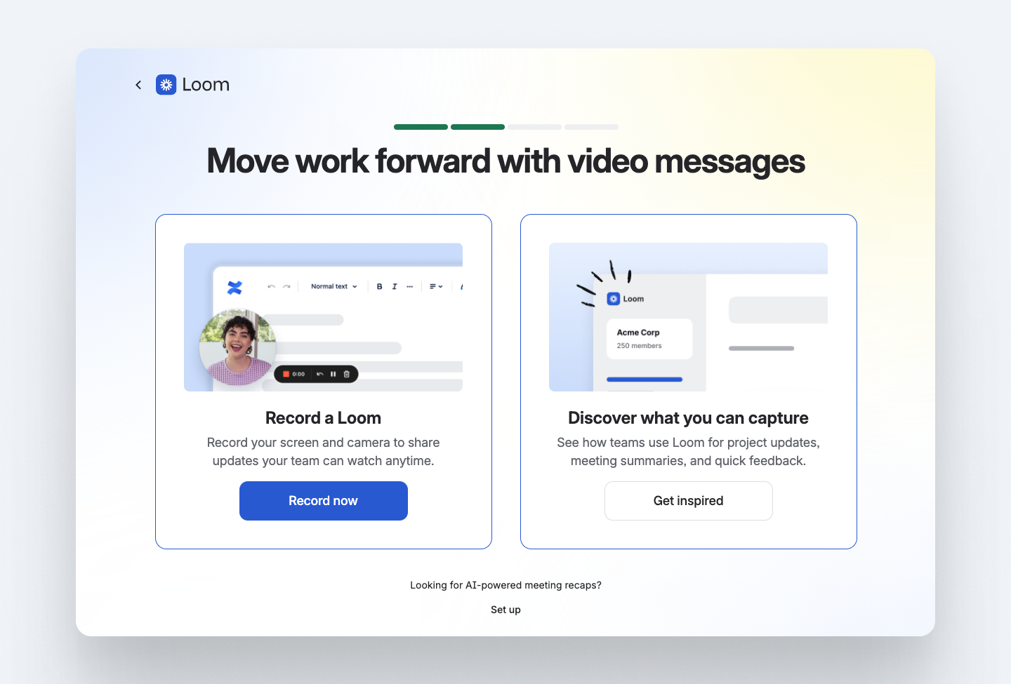
Wasting no time at all, the very next step in the wizard setup is choosing between recording a Loom video right away, or learning more about the product. This makes it feel like the onboarding is cut in half, because the user can get to their first completed task right from the second step.
Customizing the dashboard for the use case
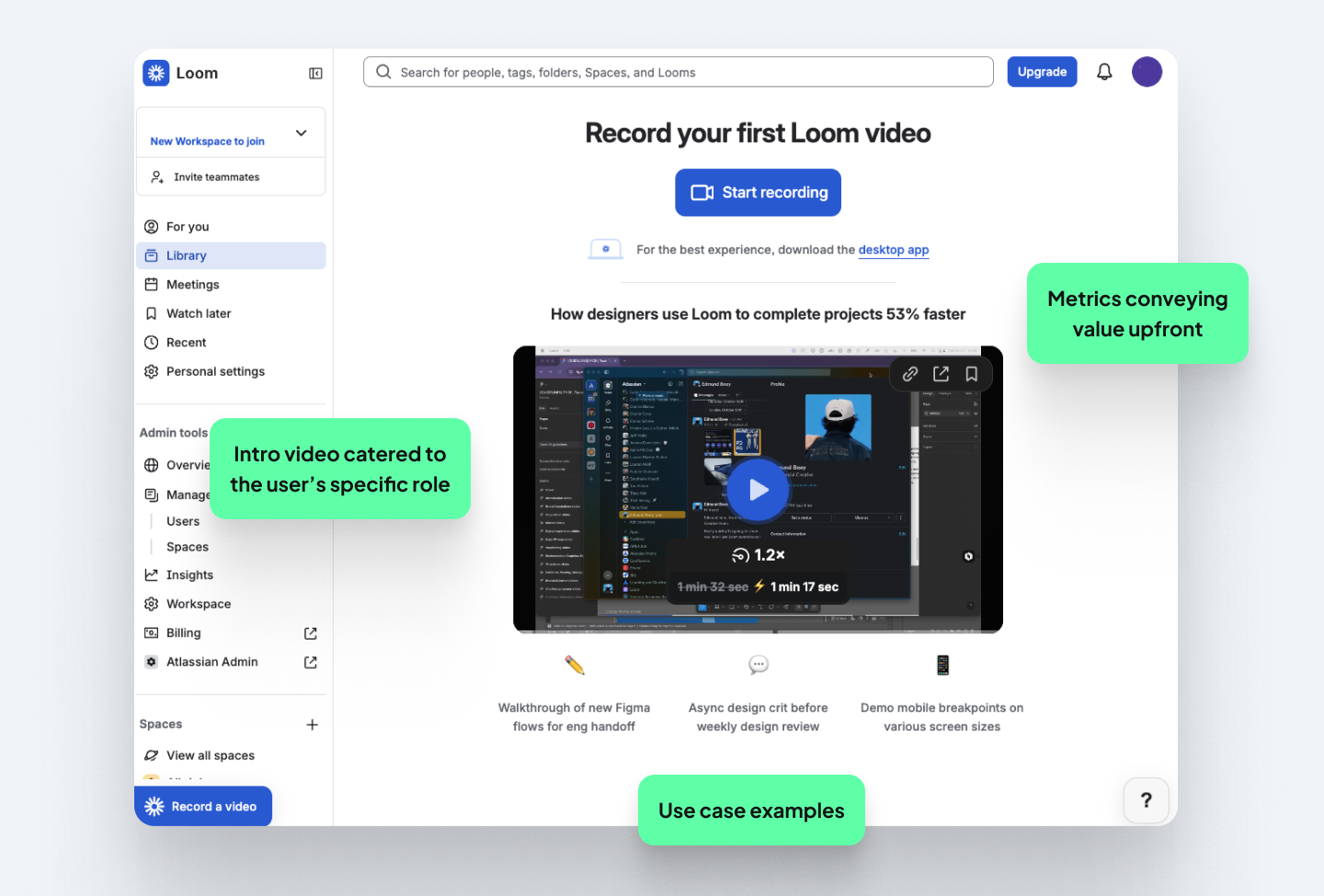
Everything on the dashboard is personalized to what the user chose to use Loom for. There are easy-to-scan use cases and a tutorial video with examples of what Loom can do. This expands the user’s mental model on how they can further use the product. Education is paired with the action with a clear “start recording” button at the top.
Lesson: Consider the dashboard as the onboarding space. The action most critical to retention should be upfront, not buried inside navigation.
Typeform: using their actual forms
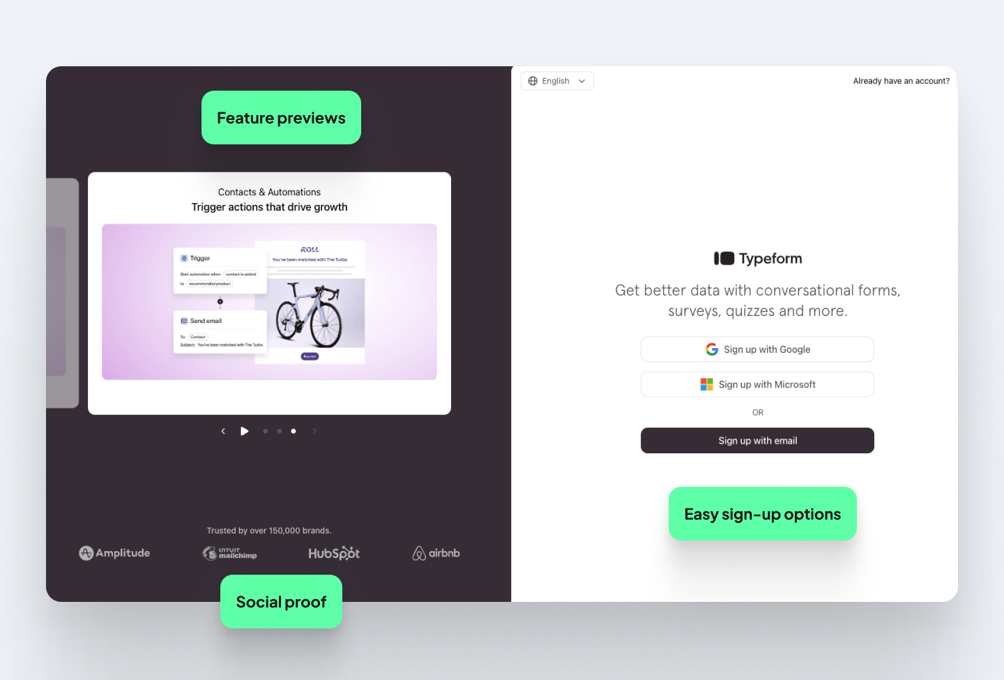
Typeform's onboarding mirrors the experience it helps users create. The setup flow itself is built like a Typeform survey, which is a clever way to show users what their own audience will experience while making the onboarding feel light and engaging.
Where most SaaS flows start with a bare-bones sign-up page, Typeform treats it like the first onboarding screen. Before a user has created an account, they're shown product visuals, use cases, and social proof.
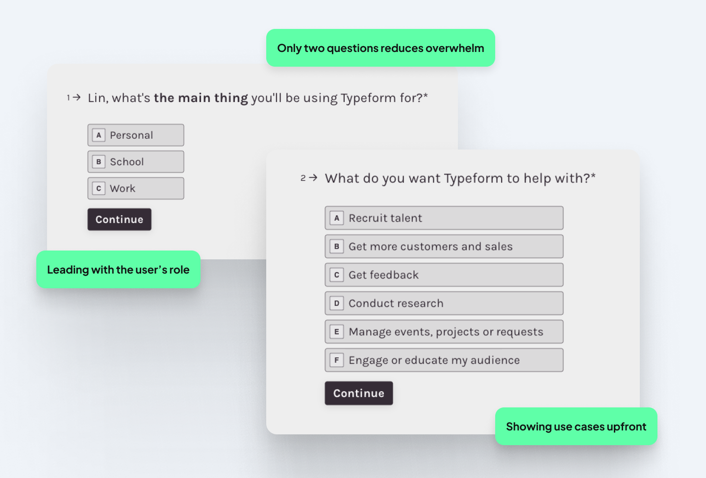
The time-to-value (TTV) is quick. Just two questions, in fact: what your role is, and what you want to do with Typeform. It's a smart way to show the product's core value before the user has built anything.
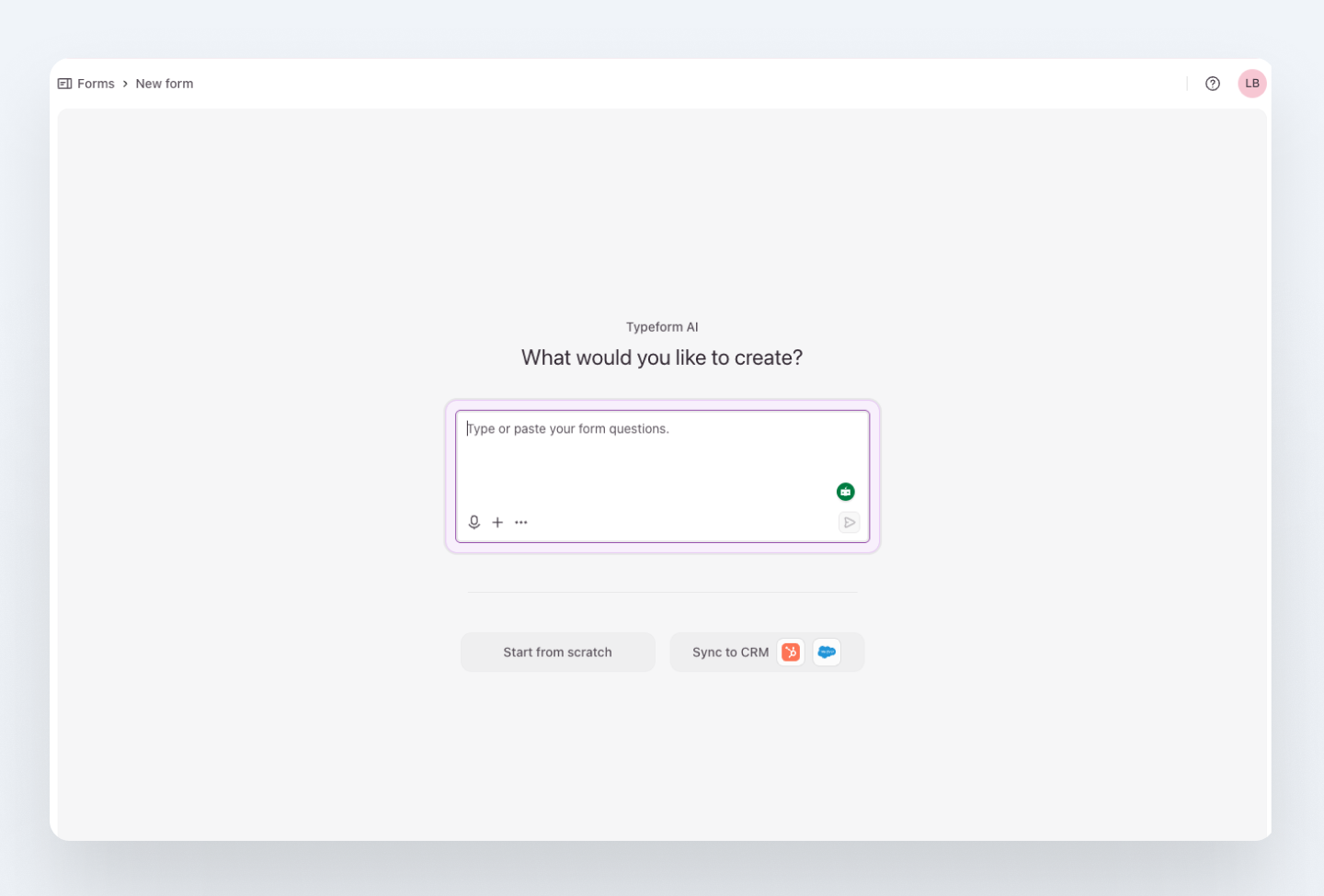
Thereafter, you’re immediately taken to the AI form creation page. The minimal screen keeps the main task at hand, and a purple border around the textbox indicates what to do first.
Back on the dashboard, upgrade prompts aren’t overwhelming and the user isn’t presented with a subscription screen upfront. Since Typeform is guided by a product-led growth (PLG) strategy, it has a static in-app banner that leads with value (getting more free responses). This background keeps key actions visible and doesn’t feel too sales-y.
Lesson: If your product has a distinctive interaction model, let the onboarding use it. The onboarding itself becomes the product demo.
Grammarly: considering users of all abilities
Grammarly's onboarding answers the user's most important question, “Is this worth my time?” before they've created an account. On the first screen, users are asked what their work is for, which makes the experience feel relevant from the start.
Each step is focused
Grammarly’s onboarding flow feels effortless since it’s broken up into small steps. The flow follows a “one screen, one action” rule: each screen asks a single question or requests one action. A stepped progress indicator at the top shows exactly how many steps remain, which removes the anxiety of not knowing how long the setup will take and creates a sense of completion and progress.
The UX copy is also kept short and direct throughout, and the UI stays minimal so nothing competes for attention. This combination of clear progression, single actions per screen, and straightforward instructions makes the onboarding feel simple even when the tasks themselves require multiple steps.
Small accessibility details
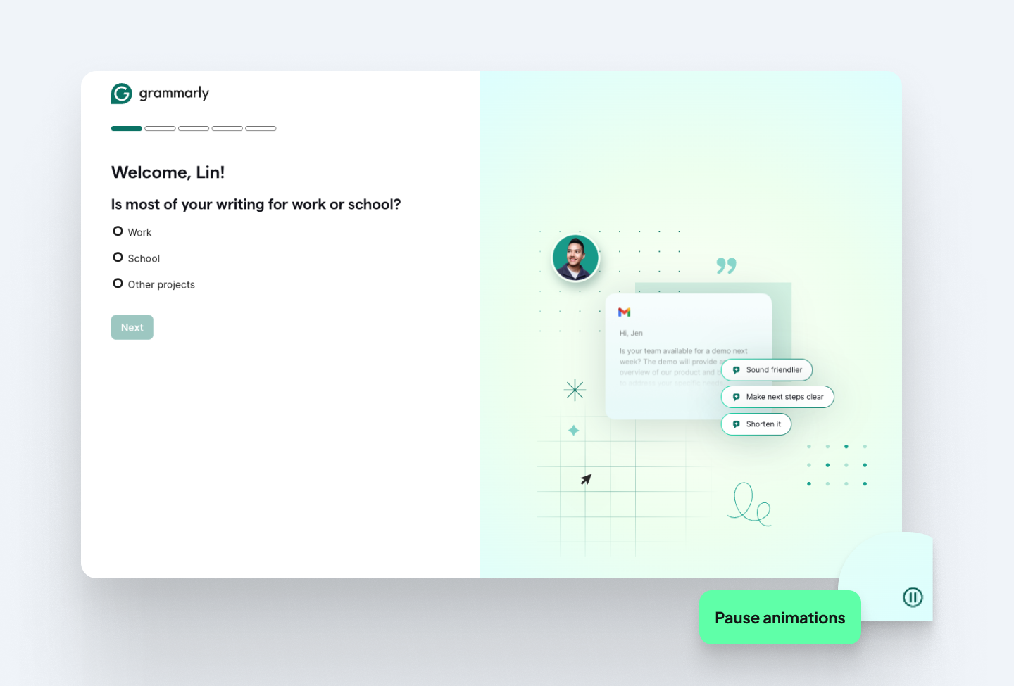
One of the more thoughtful details in Grammarly's onboarding is easy to miss but crucial for users of different abilities. An animation plays automatically on the right side of the screen, but there’s a pause button at the bottom.
Continuous motion (like animated looping GIFs or marquees) may distract users with ADHD or dyslexia, making it harder to read static text. With the subtle pause button Grammarly shows that they consider users beyond the majority case, which is exactly what good UX does.
Guiding users through the tricky bits
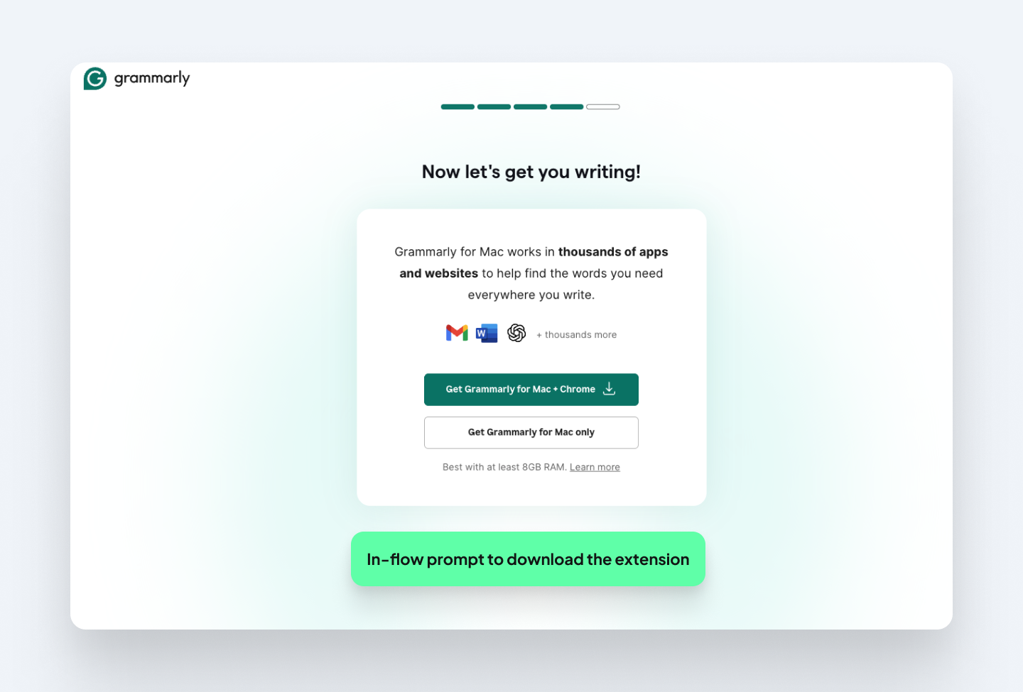
Downloading the browser extension is the activation milestone, but it can take users out of the flow and cause drop-off. So, the fourth onboarding step uses a clear visual hierarchy to guide users toward installing it, with a prominent primary CTA and a de-emphasized secondary button.
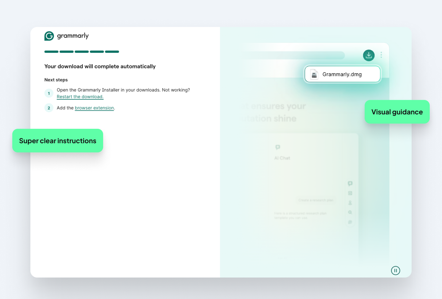
After clicking to install, the final screen has two clear steps explaining how to find and open the extension. Paired with an example image, users never have to figure out what happens or where to go after they click.
Once the extension is installed, users experience Grammarly in the context where they would write, which is when the product's value becomes useful and repeatable.
Lessons: Users of all abilities exist and accessibility features signal that you’ve thought carefully about who your users are. And for any action that takes users outside of the flow, a visual showing what happens next reduces drop-off.
Copyfolio
Copyfolio is a brand-building tool for writers, content marketers, and social media professionals who need a portfolio, website or blog. It's also a UX studio product, which means we've had years of direct insight into what makes its onboarding work ( and what needed fixing). Read the full case study here to see how we achieved a 40% conversion rate.
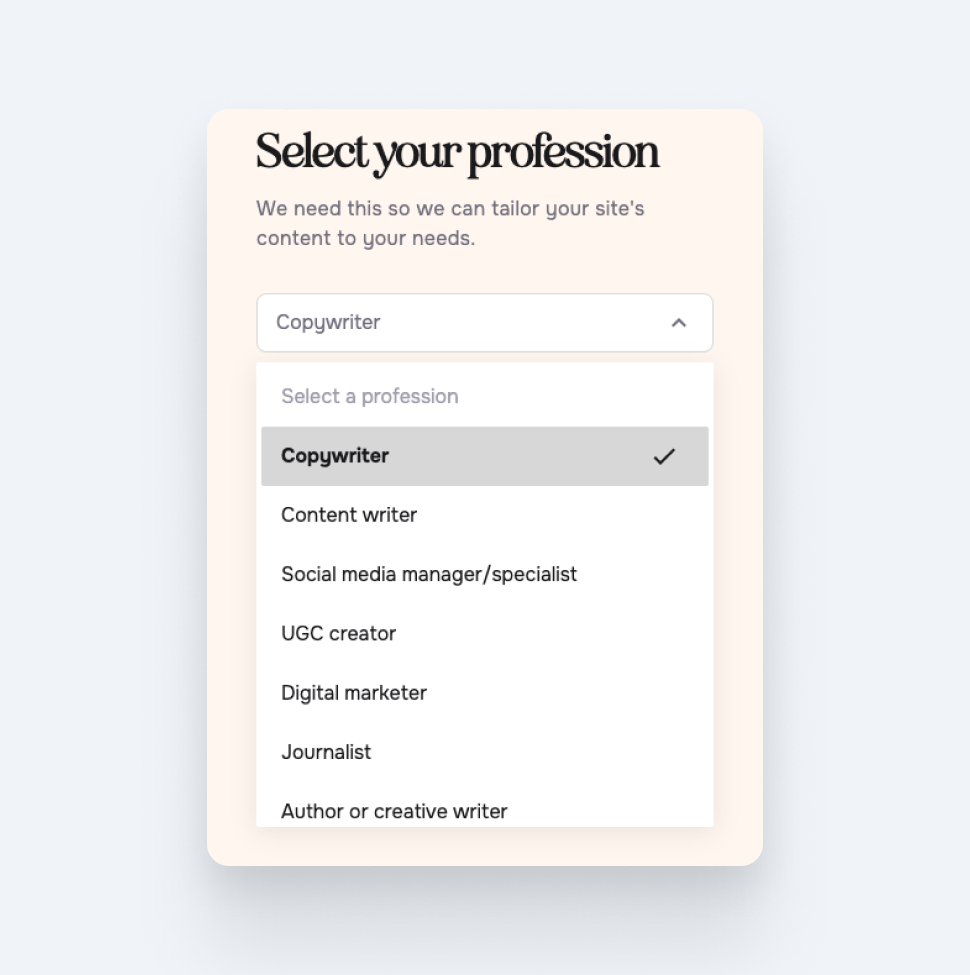
Catering for hyper-specific roles
When we launched the MVP in 2020, our onboarding was built around advertising to copywriters. But as the product grew, our user base diversified. Our new onboarding starts with a dropdown menu with a wider range of creative professions to choose from, based on user research.
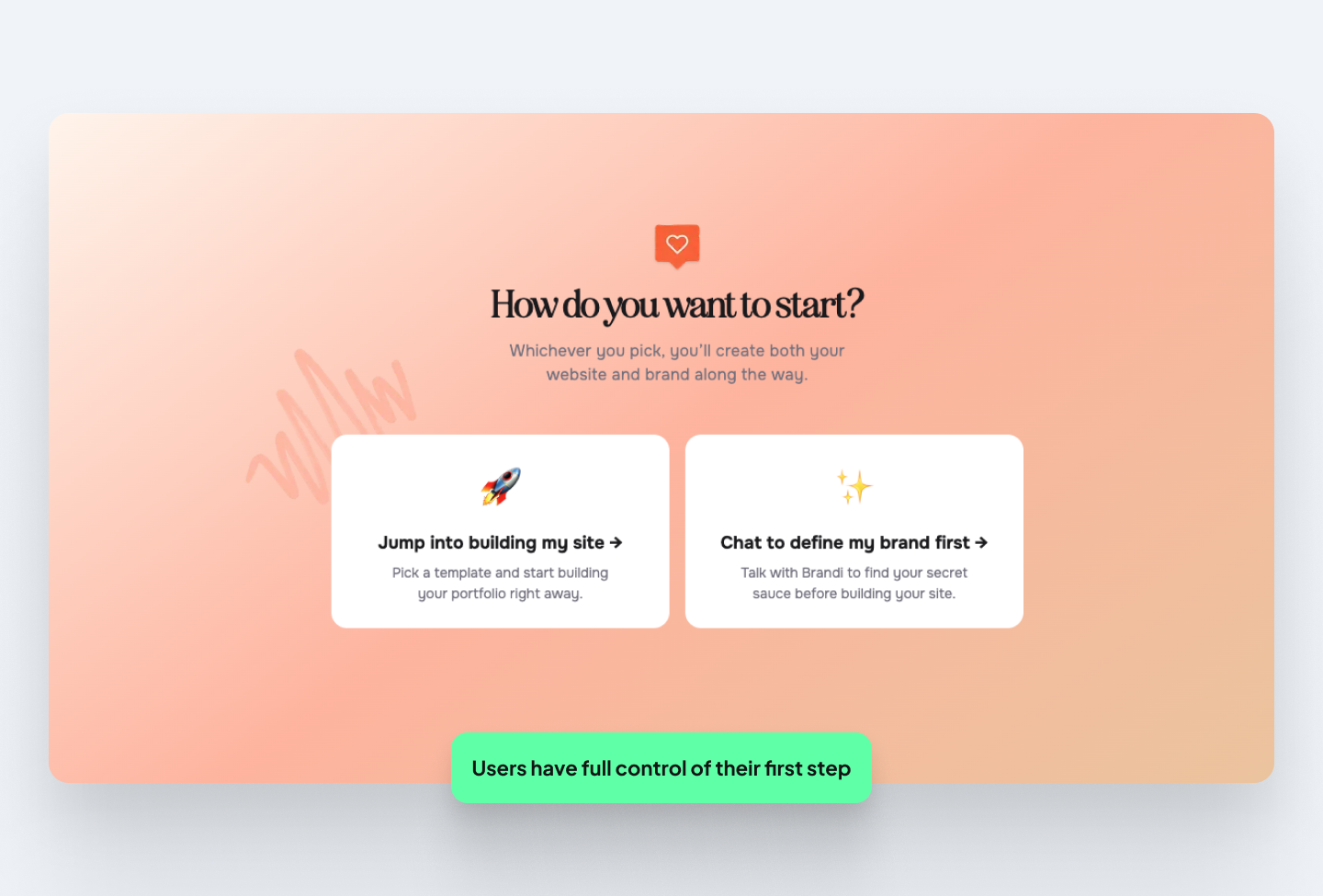
Letting users choose the next step
Before even asking users their name, the first screen asks them if they want to build their site immediately or define their brand first. Since this product doesn't require as many upfront details (like Oxa, for example), this screen as the starting point allows people to start using the product right away.
Onboarding becomes a branding session
The ‘aha’ moment in Copyfolio’s onboarding happens during the chat with Brandi, the platform’s AI branding coach. If users choose to chat to define their brand first, they are led to a conversational interface. Users answer a few questions about what they do, who their target market is, and what makes them unique.
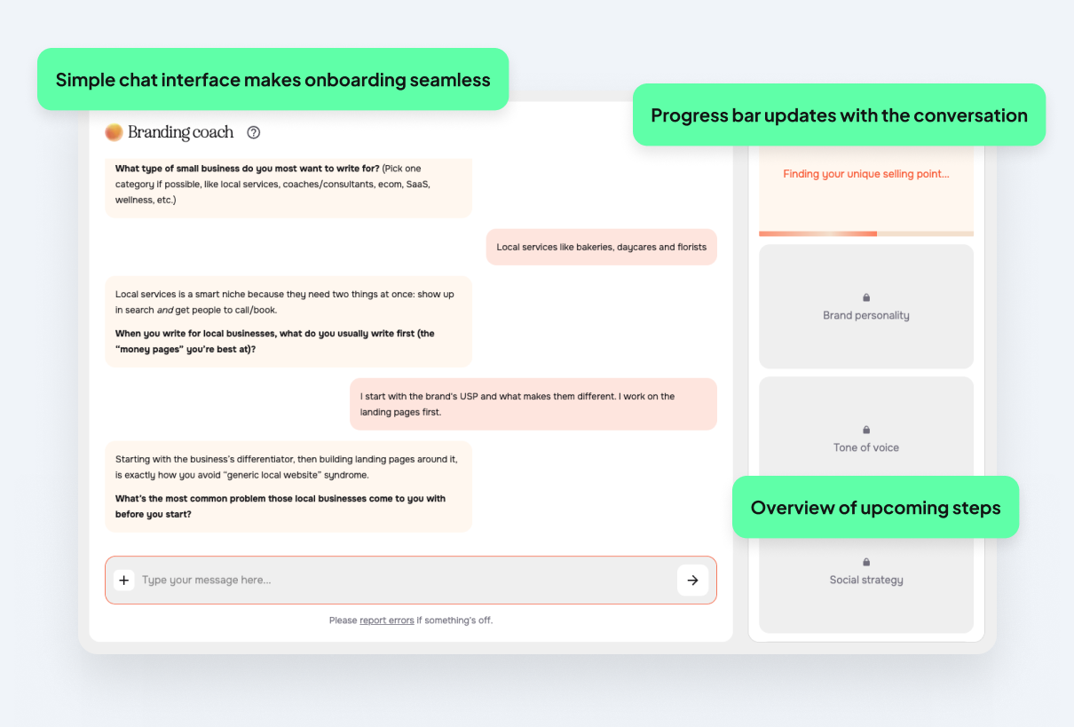
Brandi then transforms that conversation into a clear brand direction and messaging written in their own voice. Progress indicators on the sidebar indicate key steps that fill up as the onboarding process goes on. The key to Copyfolio’s conversion success is that instead of just learning about the platform during onboarding, users get to start building their portfolio straight away. By the end of the onboarding chat, users have a tagline, a color palette, a font pair, portfolio projects added, and even a social media strategy.
This is what makes Copyfolio’s onboarding stand out: rather than treating onboarding as a purely functional walkthrough, we turned the process into a value-delivering experience. What usually feels like a complex personal branding exercise becomes something concrete and actionable for our users in just a few minutes.
Removing the biggest barrier to conversion
Getting to something that already looks like yours removes the most common reason people abandon tools early: not knowing where to start.
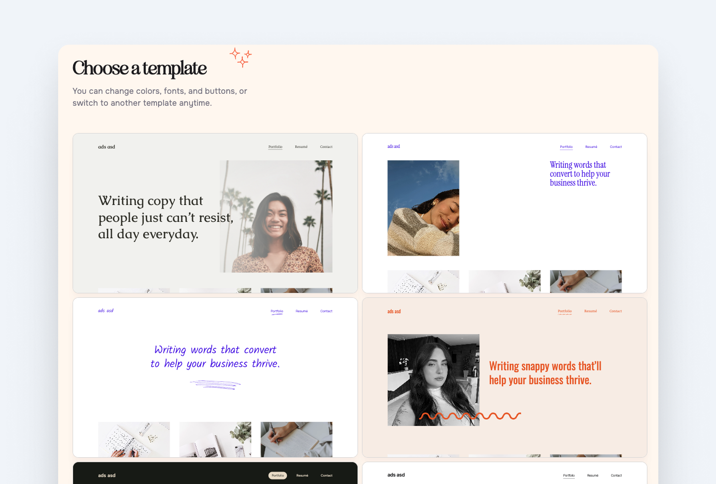
If users choose the option of “jump into building my site”, a range of customizable templates are surfaced. Instead of landing on a blank page, pre-defined layouts and styles get half of the job done. This flow helps users reach their first meaningful win right in the onboarding process.
Users who don't start building their website during the first session rarely come back to finish it. Now, since each user has a custom starter site, even if they leave the session, they have something that they are more likely to return to.
Pre-filled content and AI suggestions
Templates arrive pre-filled with sample content, so users never face a blank page. In the example, a sample heading gives users an idea of what they can add to the page, and cuts their work in half with content that they simply need to edit.
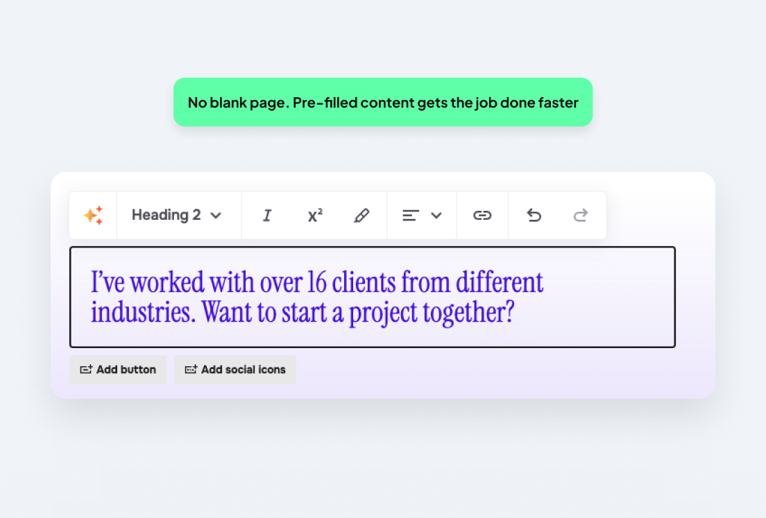
The pattern here is progressive disclosure with a low-effort first win. Using sample content helps the user move between sign-up to having a portfolio that they are ready to share quickly.
Lessons: Always identify your key conversion point through research as it might not be what you assume it is.Start with a high-value, personalized interaction (like Brandi does) that delivers immediate outputs, then guide users into the platform’s features once they’re already seeing results. Where possible, pre-fill content personalized to each user.
What does good onboarding look like?
The examples above all balance user education, motivation, and reassurance without making the process tedious. They’re designed for how users should feel, not just what they need to do.
Let’s look at five things a user needs to feel at every stage of the journey: clarity, confidence, relevance, and most importantly, the ‘aha’ moment.
1. Clarity: show users where they are
Users should know where they are in the process and how much is left of it. A progress bar, checklist or a step counter can help users to know where they are in a process. Uncertainty causes friction and nobody likes that. UI elements like these remove the anxiety of not knowing how long setup will take and creates momentum toward completion.
2. Confidence: let users try before they finish
Give users a guided way to try a core feature before onboarding is complete, without taking them outside the product. Letting someone experience a key action early builds trust in their ability to use it, which keeps them moving through the flow.
3. Relevance: personalize from the first question
The onboarding experience should feel personalized to why the user signed up. Even a simple question at sign-up (“what are you here to do?”) can be the difference between a flow that feels generic and one that feels personal. Loom asks users what they’re here to do, then personalizes the rest of onboarding to fit their answer.
4. The ‘aha’ moment: get users there fast
The ‘aha’ moment is where a user goes from “this might be useful” to "this is exactly what I need”. For Calendly, that moment is often when a user connects their calendar and sends their first scheduling link, because it immediately removes the back-and-forth frustration of booking meetings. For Figma, the ‘aha’ moment is when users realize they can open and collaborate on a design file directly in the browser without needing to install an app.
This moment matters because everything before it is friction, but everything after it works toward retention. Map the shortest path to that key moment and remove anything that doesn’t contribute to it.
Is your onboarding losing you users?
The cost of poor onboarding is easy to underestimate. Does your onboarding suffer from the following?
- High drop-off rates
- Low feature adoption
- A frustrating spike in support tickets
- Users completing setup but not returning
These are signs that your onboarding may be built around assumptions rather than evidence of how your users really behave.
Steps to improve your onboarding include setting up analytics to track metrics, watching users interact with your flows, and running a UX audit. Let’s break these down.
Success metrics to track
Good onboarding is only as good as your ability to measure it. Analytics will show you whether the onboarding works and where to focus if it doesn’t. Here are 5 metrics worth tracking.
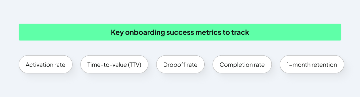
- Activation rate: the percentage of new sign-ups who complete the key actions that correlate with long-term retention. A healthy rate sits between 40 and 60%. Below that, there's usually a structural problem in the flow that’s worth investigating.
- Time-to-value (TTV): how long it takes a new user to reach their first meaningful outcome. Every unnecessary step adds to this number, and reducing it is usually the most impactful improvement a product team can make.
- Completion rate: the percentage of users who finish the full flow. Low completion rates indicate too much or too little information, friction, irrelevance… or all of them.
- Drop-off rate by step: where in the flow users leave. This is your most actionable metric, because it tells you which screen to fix first.
- 1-month retention: the percentage of users still active a month after sign-up. If this is low, the onboarding is likely getting users started without giving them enough early value to come back.
Go beyond guesswork with UX research
Watching a new user (ideally someone unfamiliar with the product) working through the flow is another way to see where your onboarding may fall short. Friction points will become obvious within minutes of seeing someone else encounter them.
You can do this through usability testing, or tools like Hotjar or Clarity that show where users click, how long they stay or when they drop off.
Run an audit
A UX audit conducted by a UX professional is a more structured approach to figuring out where the snags in your flows are. At UX studio, our research goes beyond just heuristic reviews and surveys. We run UX audits, speak directly to users and gather behavioral and quantitative insights that show why your onboarding doesn’t convert.
A thorough audit will:
- Pinpoint where and why users are leaving the flow
- Prioritize improvements by impact so your team works on what matters first
- Deliver actionable steps to implement straight away
- Give insights that analytics alone can’t
Ready to revamp your onboarding?
Your SaaS product deserves to succeed and your onboarding deserves the same level of attention you gave to building the product.
If your onboarding isn't converting, let us help you find out why. Get in touch with our team of UX experts and we’ll help get you there.
Credits
This blog post was written by Lindie Botes, UX designer
Editing by Dr. Johanna Székelyhidi, marketing manager and copywriter