Exploring AI design patterns in Saas products

Users expect software to be consistent, predictable, and easy to trust. AI breaks those expectations. The same input can generate different outputs, errors happen in fragments, and explanations are often too complex. Let’s look at how thoughtful UX design can bridge the gap between unpredictable AI and user confidence.
.png)
UX design challenges in AI SaaS
At UX studio, we have had the chance to design several AI-heavy applications. Working on these projects has given us a direct view of how AI reshapes familiar patterns and what kinds of design decisions are needed to make them useful in practice.
Each UX design challenge in AI SaaS tools comes down to the same problem: how to make an unpredictable system feel predictable enough for real work. That’s not solved by AI models alone, but by design decisions around visibility, feedback, and control.
- Transparency without overload
Users want to know why the AI produced a certain output. But a full breakdown of model reasoning is unreadable for most. We used collapsible explanations and surface-level reasoning highlights, so users could dig deeper only if they needed. - Trust with variable results
In traditional SaaS, an unexpected result feels like a bug. In AI SaaS, the same surprise might be perfectly valid. This requires UI elements that normalize variability: version histories, confidence labels, or even language that frames results as suggestions rather than facts.
AI patterns in SaaS products
AI solutions in SaaS are quite diverse. Well-known AI products already use it in a variety of ways: Zoom improves video quality and reduces background noise with AI, DocuSign verifies signatures and strengthens document security, and Slack’s built-in bot automates small but frequent tasks like scheduling reminders, while also summarizing channels and threads and providing daily recaps.
Each of these integrations changes what users expect from the product and how they interact with it. SaaS tools like these set the standards in UX, as user expectations need to be matched for better familiarity and intuitive processes.
AI introduces some clear differences compared to traditional patterns:
- Outputs become variable,
- the quality of input matters much more,
- and human review is built into the flow.
Let’s take a closer look at how these differences play out in practice.
What makes AI SaaS different from traditional SaaS
1. Variable outputs
In most products, the output is predictable: the same input always produces the same output, and user flows are built around that consistency. AI shifts the ground. Results can change from one run to the next, which means design must help users get the right output, or at the very least, provide options to judge outputs rather than just accept them.
This matters because unpredictability is not just a design quirk. It touches bigger issues:
- Trust, since users need to believe the system is reliable even when results vary. If you are interested in the trust aspect in more detail, we covered it in a separate article: How to build trust in your AI product.
- Bias, because outputs depend on data quality and hidden assumptions in the model.
- Privacy, as AI often processes sensitive documents or user inputs.
- Accountability, when decisions influenced by AI need to be explained and defended.
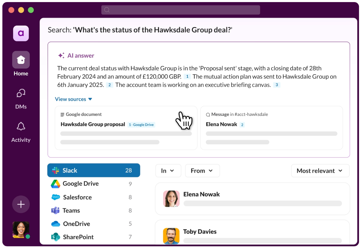
Two requests that look identical to the user might lead to very different results. That’s the opposite of what users expect in usual products. In Google Docs if you type the same sentence twice, you always get the same outcome. With AI-driven writing assistants, on the other hand, the same prompt can generate two very different drafts.
Since current AI models are black boxes and the outcome is hard to predict, AI products should give users the means to shape the output. Features like version history, side-by-side comparisons, or easy regeneration are no longer “nice-to-haves,” they are core to the experience.
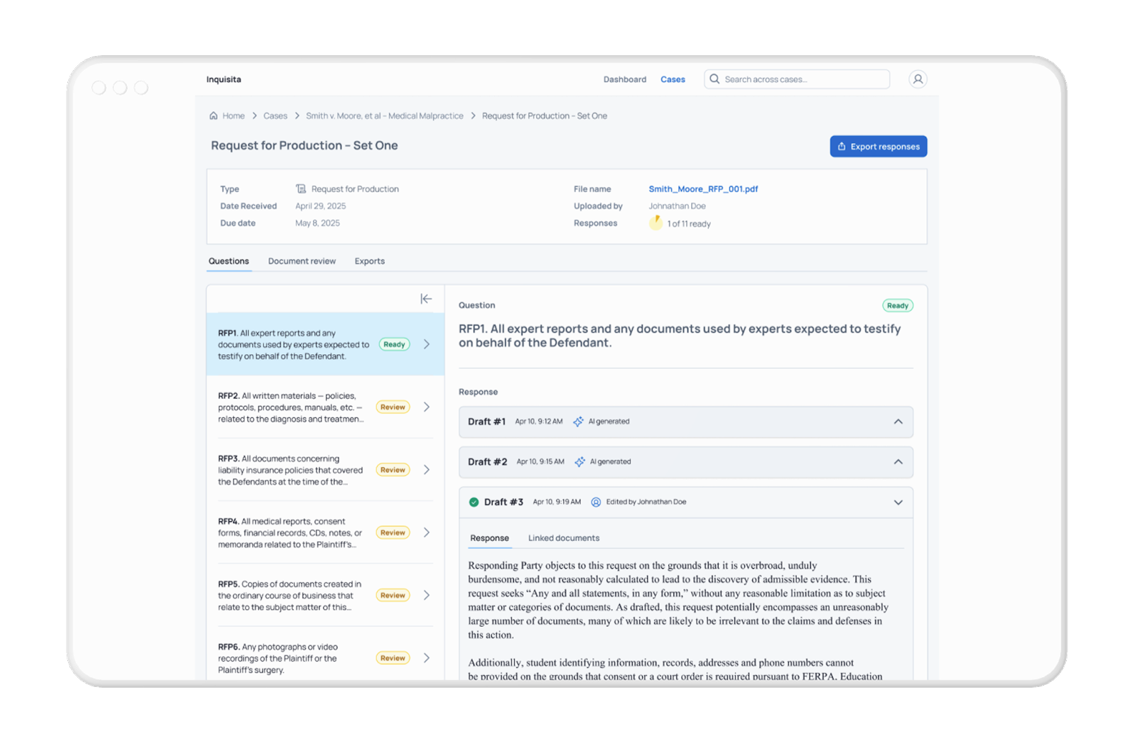
One of our recent client projects, Inquisita is a prime example. It’s an AI-powered legal tool that helps law firms draft responses to discovery requests by scanning and analyzing client documents. Version history became much more important than in a standard document editor, since users often wanted to step back and forth between AI attempts to choose the one that worked best for them.
2. Dependence on data quality
Traditional SaaS usually restricts what users enter through forms and validations, which try to prevent poor inputs. In contrast, AI often relies on unstructured text or documents, and here the input quality directly drives the output. If client documents are missing or inconsistent, the AI’s results will be the same. Design must highlight these gaps, show what the AI could and could not process, and sometimes even block the workflow until the input is usable.
In Inquisita, the product generated draft responses based on client-provided materials. If the uploads were incomplete, the AI’s output would reflect those gaps. To help users prepare stronger input, we added clear instructions at the upload step.

We also designed a “Document review” section where users could check whether their uploaded files were relevant to the case. This lightweight safeguard helped users feel more confident that the AI was working with the right materials, without forcing them through extra steps or heavy validation.
3. Human review as part of the process
Even the best AI models can produce errors, overlook context, or phrase something in a way that does not fit the situation. That is why most AI products, including AI SaaS products, rely on human oversight as a built-in step. The design challenge is to make this review feel like a natural part of the workflow rather than an extra burden.
To combat this, we added inline review tools so users could quickly accept, adjust, or reject an AI-generated draft right where they were working. We also designed reasoning displays that explained why certain documents or sources were linked to a response. This gave reviewers confidence in deciding whether to approve the draft or request changes.
These small design choices turned review from a chore into an integrated step, reinforcing accountability while keeping efficiency high. The AI produced the first draft, but it was always clear that the human made the final call.

Common UX patterns in AI SaaS
Some interaction models from traditional SaaS survive, but many need to be reworked once AI becomes central. These patterns are not about novelty, they are responses to real user needs. They help users trust variable outputs, keep workflows moving, and make review feel like part of the job rather than an extra task.
Let’s see which patterns most commonly emerge across projects that make AI tools more usable and trustworthy. Here’s our top 6.
1. Drafting and versioning
Instead of starting from scratch, users are often given an AI draft. This changes how version history works. It’s no longer just about tracking human edits, but also about managing multiple AI attempts. Side-by-side comparisons, rollback options, and draft history become essential, since users often want to explore different drafts before deciding which one to refine.
2. Status indicators
“Open” and “done” are not enough anymore. Users need to know if the AI is still processing, if a draft is ready, or if review is pending. Layered statuses make the process feel less mysterious, especially when tasks move between automation and human oversight. Without them, it is too easy for people to assume something is broken when the system is actually still working.
3. Review interfaces
Preview screens don’t cut it in AI SaaS. Users often need richer review tools, whether that means side-by-side comparisons or inline editing. In our project, we designed a view where users could see the AI draft next to the original source material, which made it easier to accept, reject, or refine the output. The extra context reduced uncertainty and sped up decisions.
4. Transparency
AI outputs have a trust problem. It should be clearer for users to know what is human generated and what’s AI generated to avoid misconceptions.
One way to address it is to be clear about when content or actions are produced by the system. In blended products, labeling AI-generated drafts ensures users know what came from the model and what was uploaded or written by humans.
Intercom tags AI messages, and IA Writer changes the text color until the user edits it. The pattern is simple but powerful: show what the AI did, and give users control over how to use it.
5. Citations
Factuality is also a key point of concerns, as AI hallucinations and outdated training data are still common. Citations let users trace AI output back to its sources. Instead of presenting a draft as if it appeared from out of nowhere, the system adds inline references or footnotes.
Some summarizers highlight specific passages inside a single document, while others link out to multiple sources, similar to how Wikipedia handles references.
In Inquisita, AI-generated paragraphs were linked back to the documents they came from, so users could instantly verify the content. They also had the option to add new documents to generate stronger answers. This design choice turned what could feel like a black box into something verifiable and accountable.

6. Transparency and feedback
Showing how the AI reached its conclusion — even in a simplified form — builds confidence. This can be done with short reasoning snippets, confidence levels, or quick highlights of the data used. Pairing this with lightweight feedback prompts gives teams a way to improve their models without slowing users down. Instead of long surveys, a simple inline, such as “Was this useful?” at the right moment can provide valuable signals.
Summary
From our recent projects, a few guiding principles have emerged.
- AI should give users a headstart instead of taking the process away from them. In practice this often means providing a draft or recommendation, but leaving the final decision to the user.
- Confidence indicators, version history, and reasoning help users know when to double-check. Instead of presenting every output as final, the interface can signal how reliable the AI believes its answer is, and allow users to compare drafts side by side. This normalizes variability rather than hiding it.
- Too much detail is noise, but the right level of explanation builds trust. A collapsible reasoning panel or citations linking back to documents can give users clarity without overwhelming them. This allows people to dig deeper only when they need to.
- Review and oversight are necessary, but they should not feel like extra work. Inline review tools, like quick accept, reject, or edit actions, keep the workflow smooth. Moving users into a separate approval screen for every draft slows them down and makes oversight feel like bureaucracy.
- The best learning happens inline, not in long onboarding documents. Small, contextual instructions at upload, review, or editing steps prepare users for what to expect. This makes the product easier to adopt and reduces the need for external documentation.
These are not abstract theories. They came from designing SaaS products where AI had to work in high-stakes professional environments. What we found is simple: when design treats AI as a collaborator and builds for clarity, control, and trust, SaaS products become not just faster, but genuinely more helpful. See the full list of our guiding AI UX principles here.

This blog post was written by Gábor Szabó, UX designer
Fact-checking by Laura Sima, UX researcher
Editing by Dr. Johanna Székelyhidi, marketing manager